The Expanse UI Design
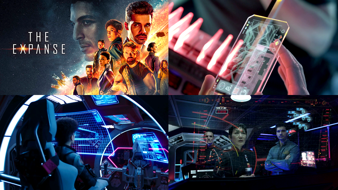
Here’s a look at the various FUI designs from the sci-fi series The Expanse.
Special thanks to Brian Benton who suggested this and provided some great links as well! A lot of the images have been collected from this massive image dump from drainsmith and further below we have some insights and images provided by Rhys Yorke who worked on The Expanse (Season 3 & 5) as a motion graphics designer.
Curved displays

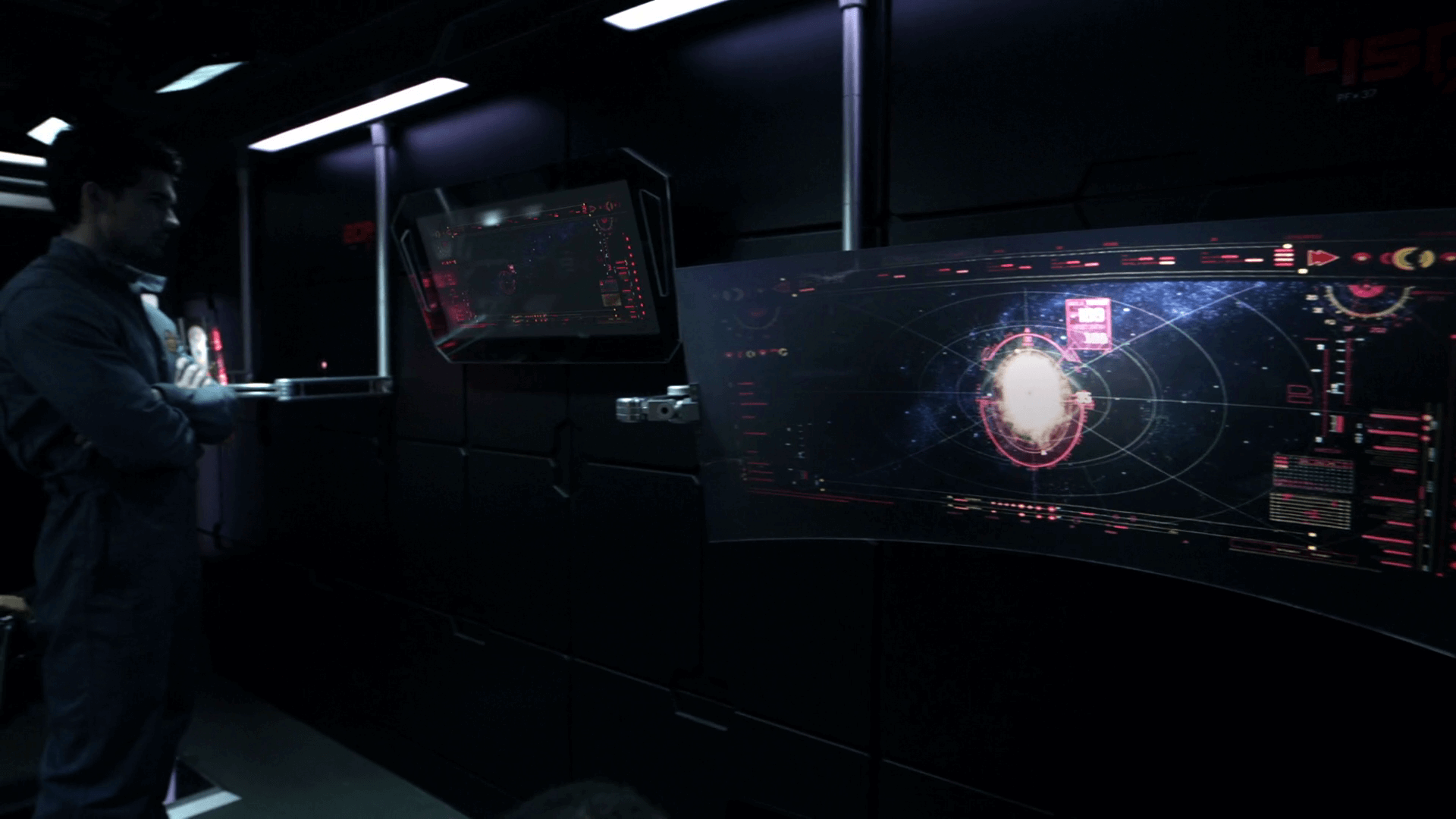


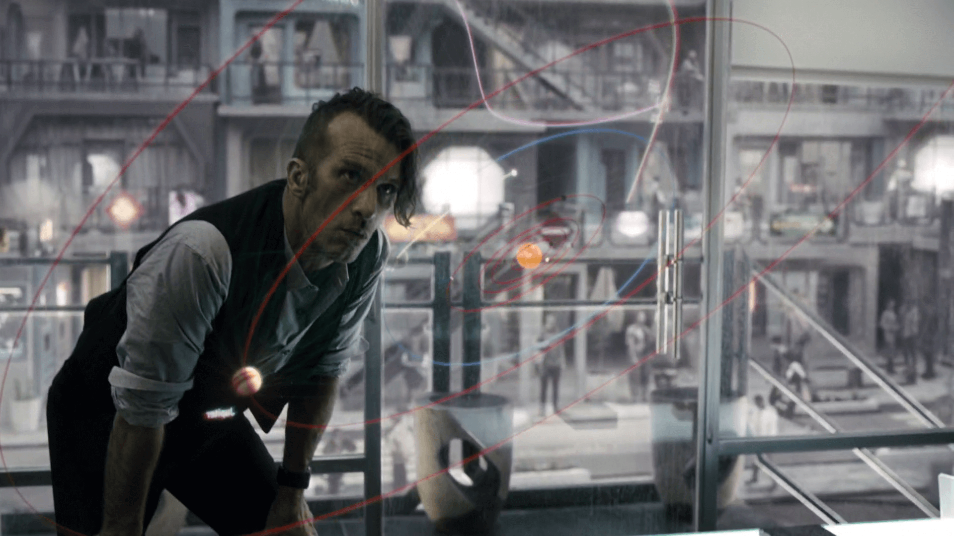
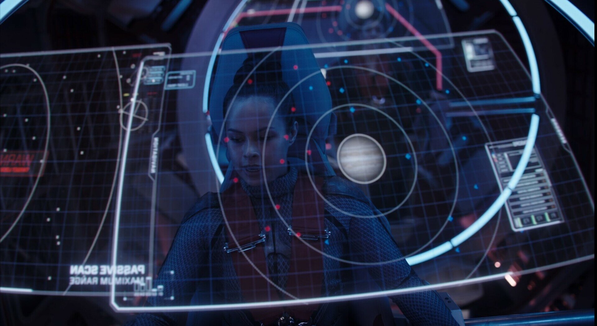
Holographic displays
Viewing maps of space is perfectly suited to holographic displays. A 2D map is simply not adequate. Having a map of space projected in a hologram or even VR allows you to grasp the position of objects accurately in three dimensions. The ability to scale and rotate using hand gestures makes a lot of sense. The Expanse demonstrates this nicely and I really like the inclusion of orbit lines and even a faint grid to give a reference to distance but also for film aesthetics.
The other holographic displays are just a nice way to present a futuristic look but also allow the actors faces to be presented alongside the UI.


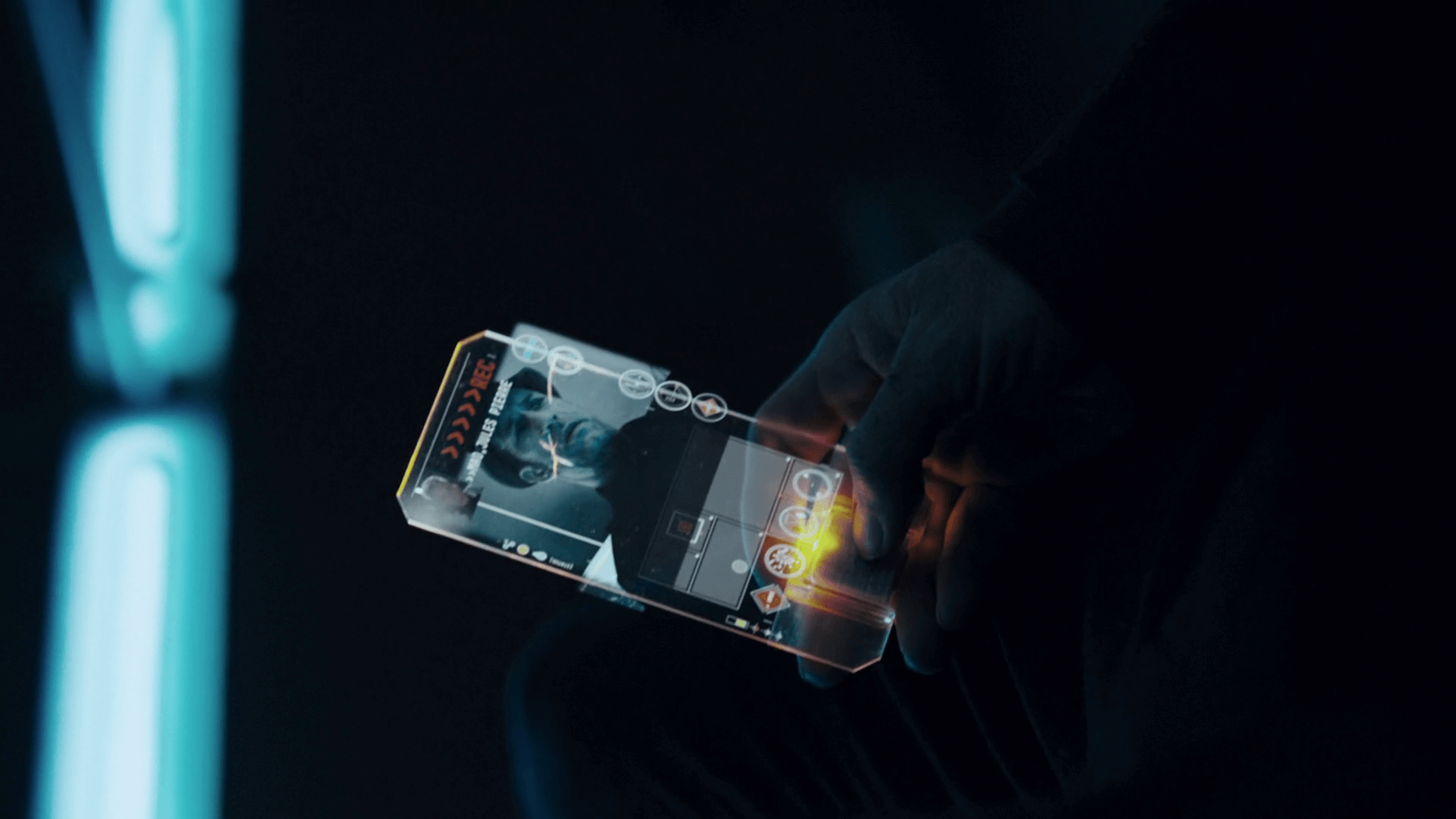
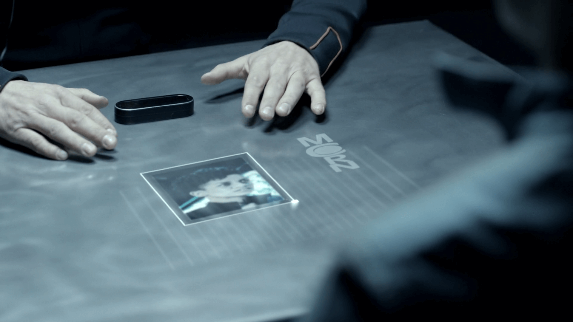
Mobile devices
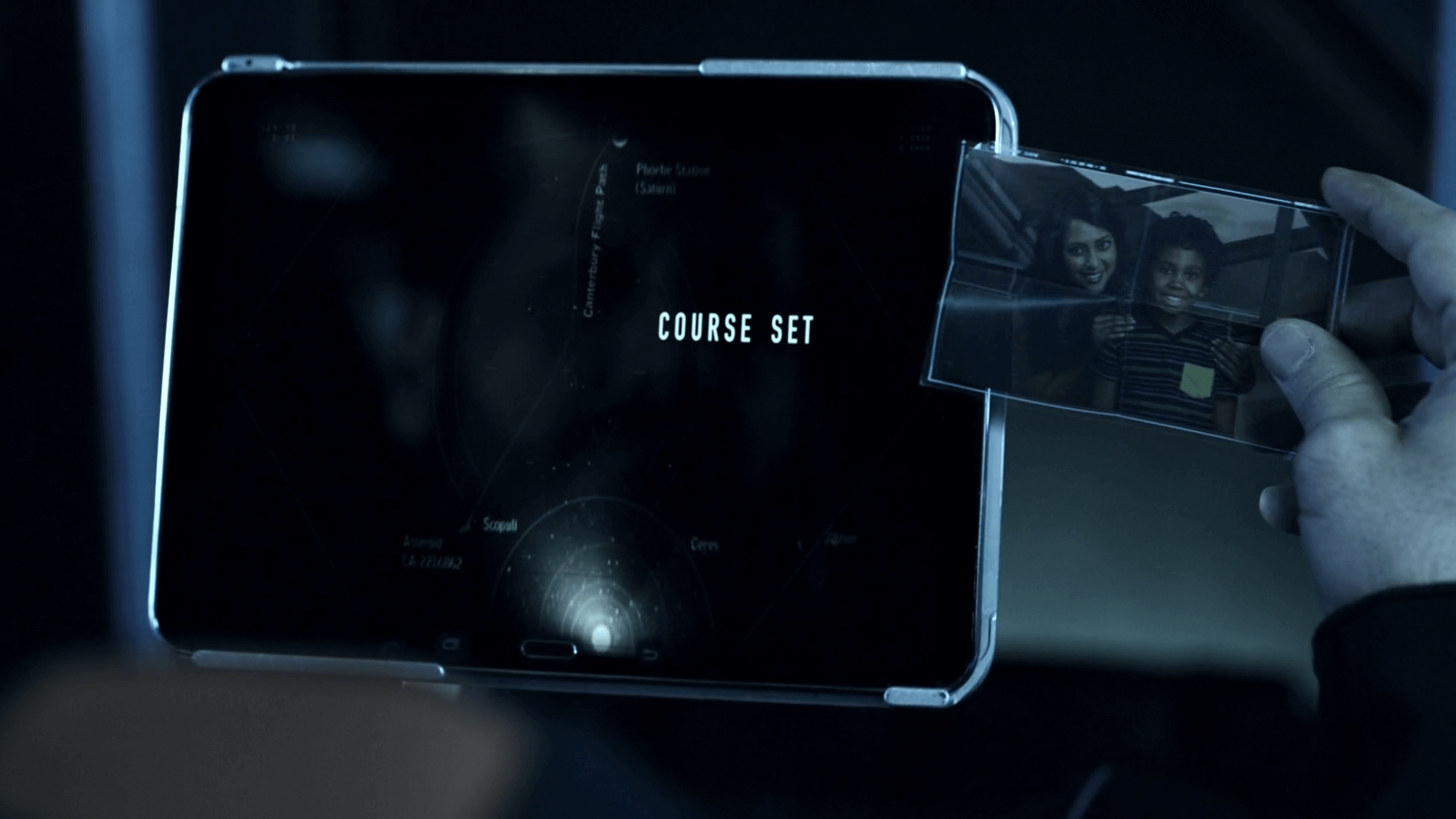
There are several handheld devices in The Expanse, many of them use see-through materials. The phone device is particularly interesting, with no visible signs of hardware besides for a small square at the bottom. It’s edge lit, projects holographic UI elements and also seems to be able to change it’s opaqueness (like switchglass or electrochromic glass) which is a great UI concept for transparent interfaces.


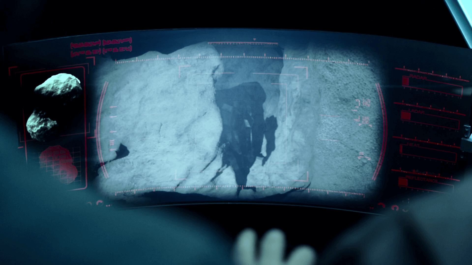
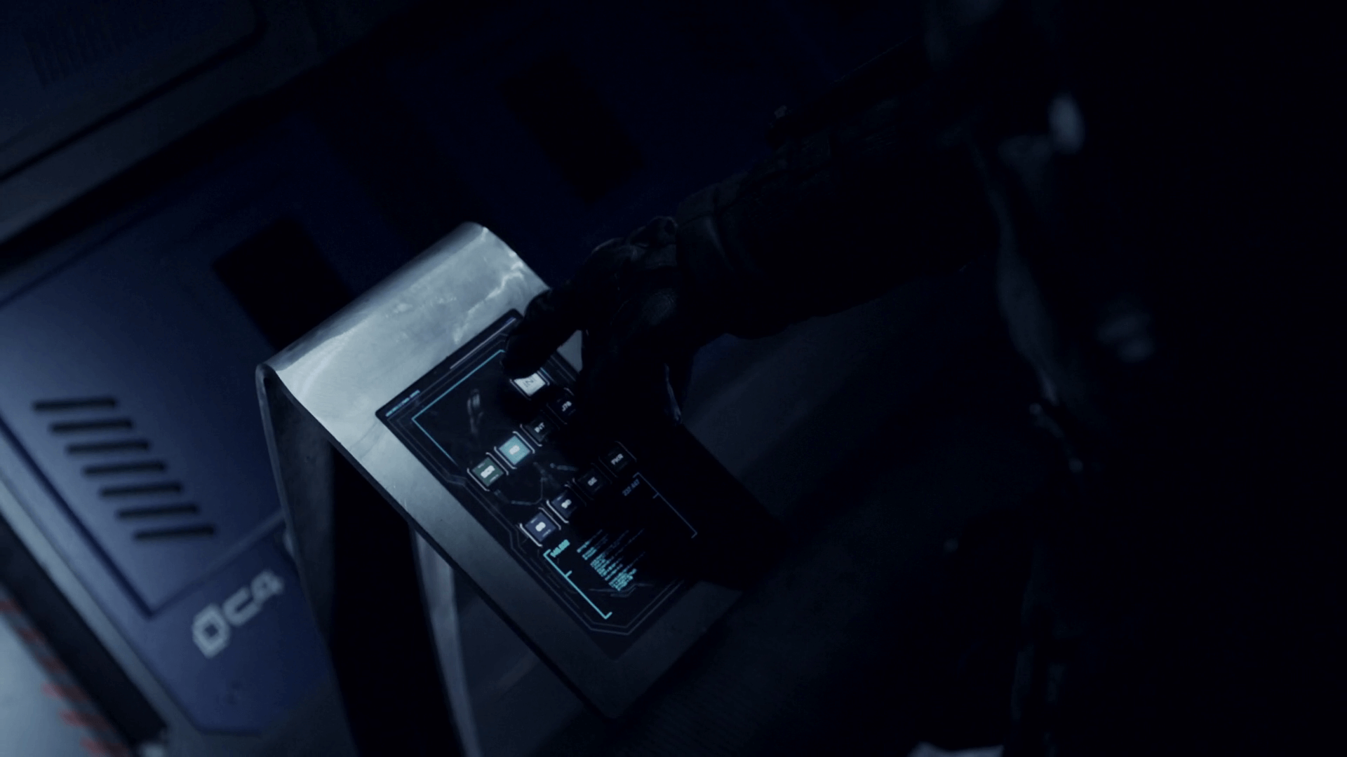
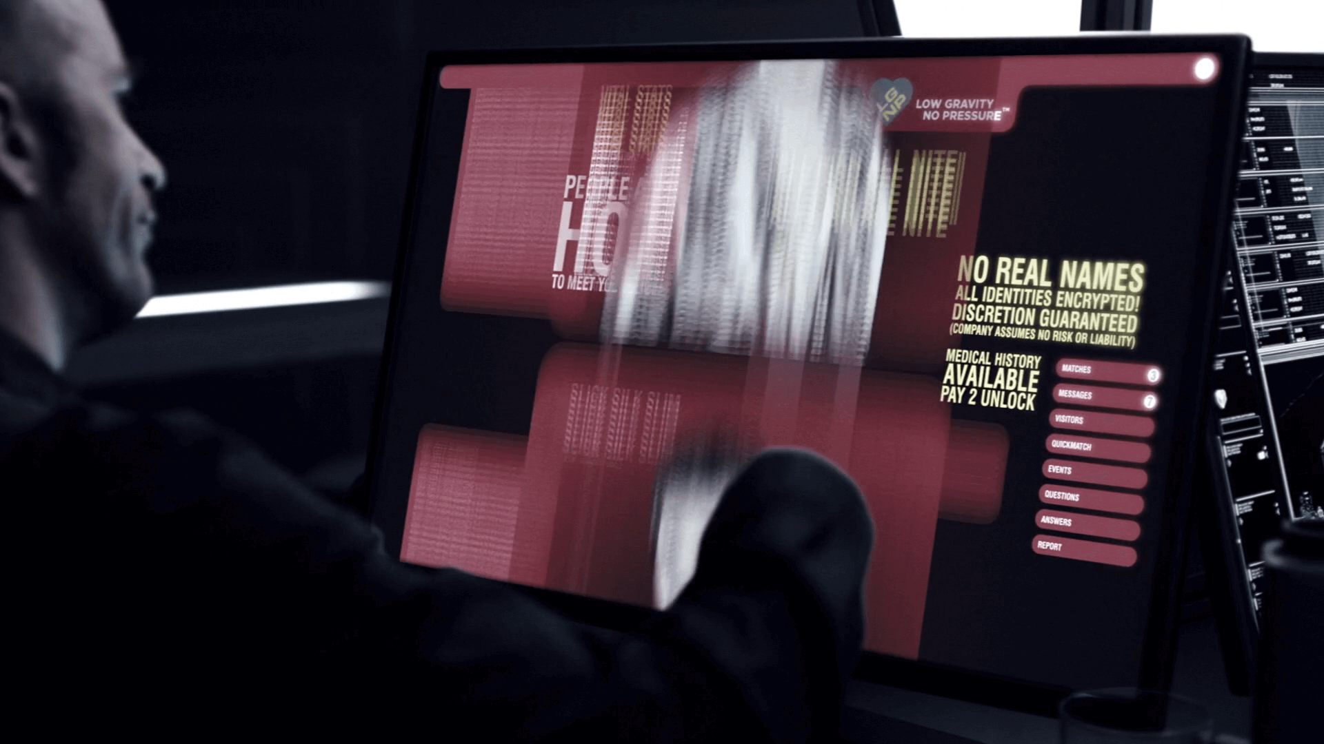
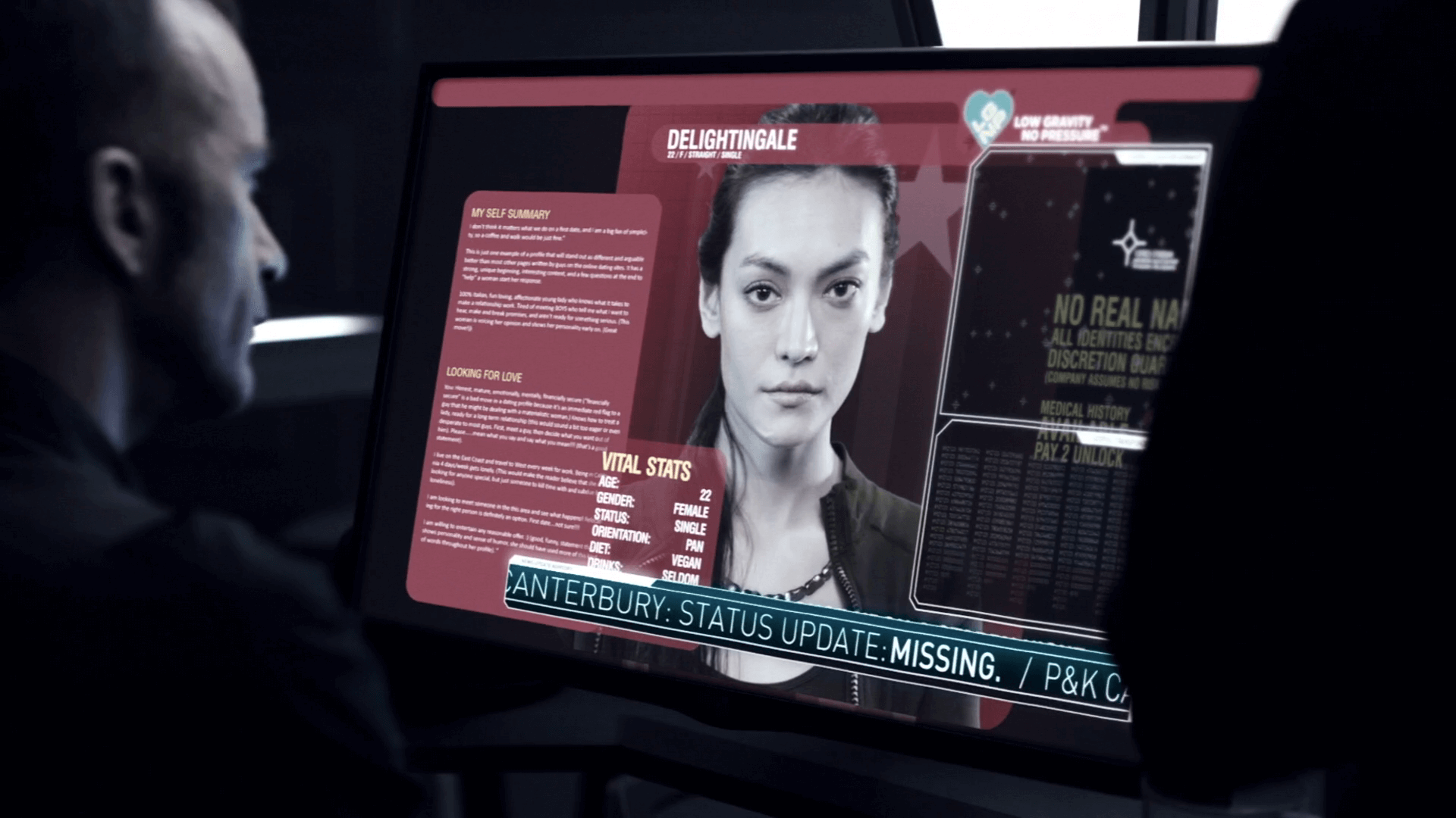
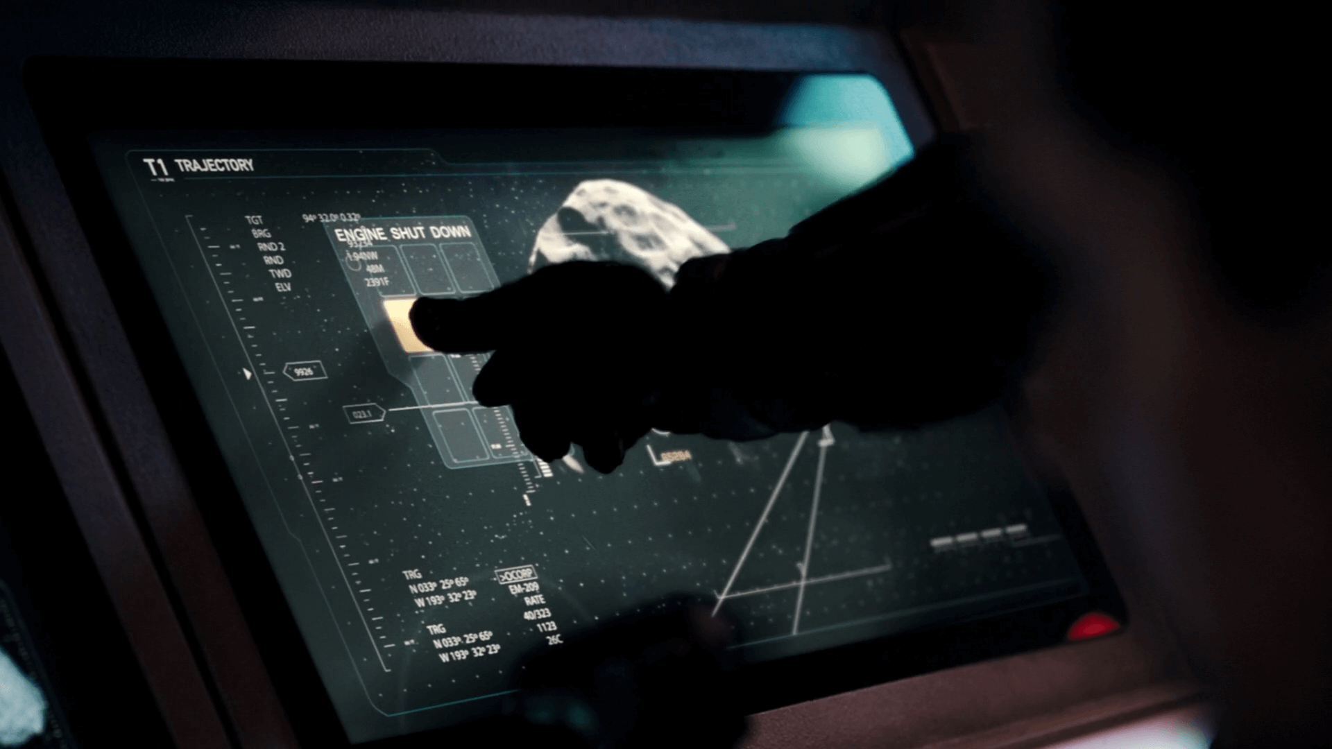
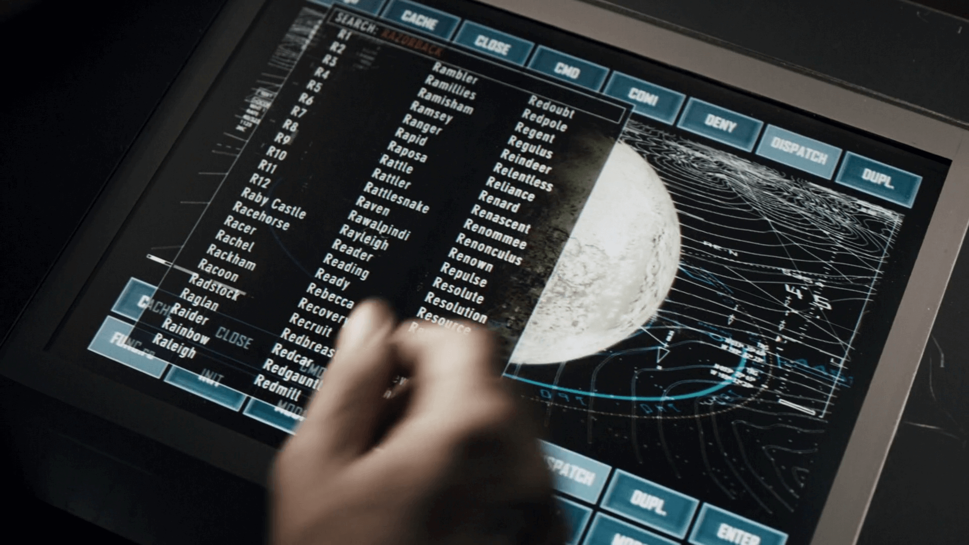
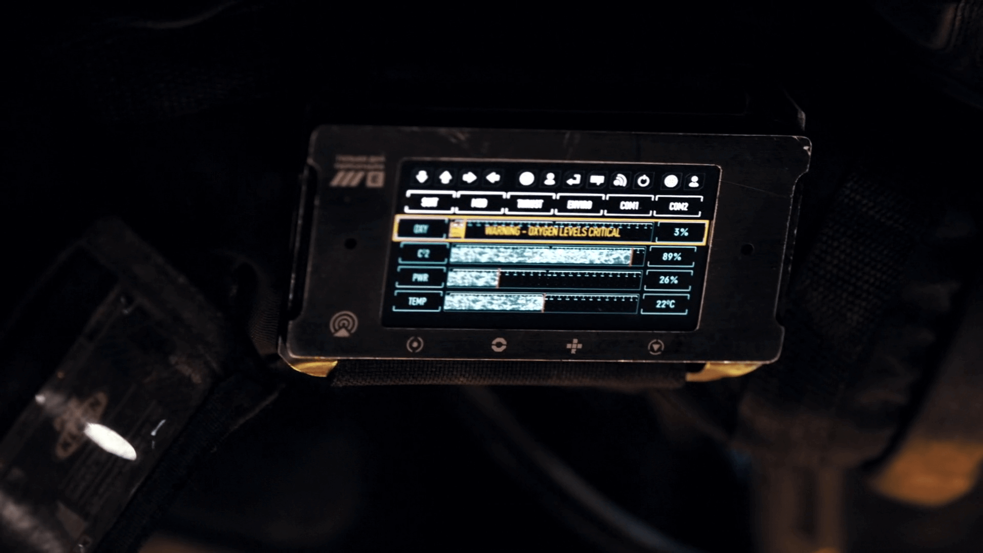
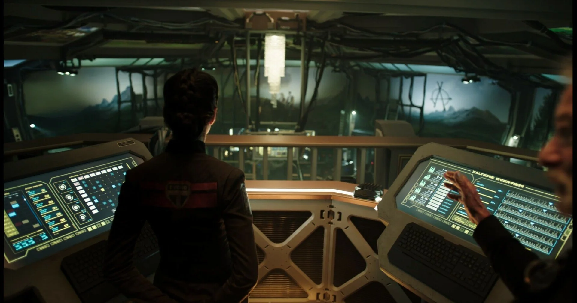
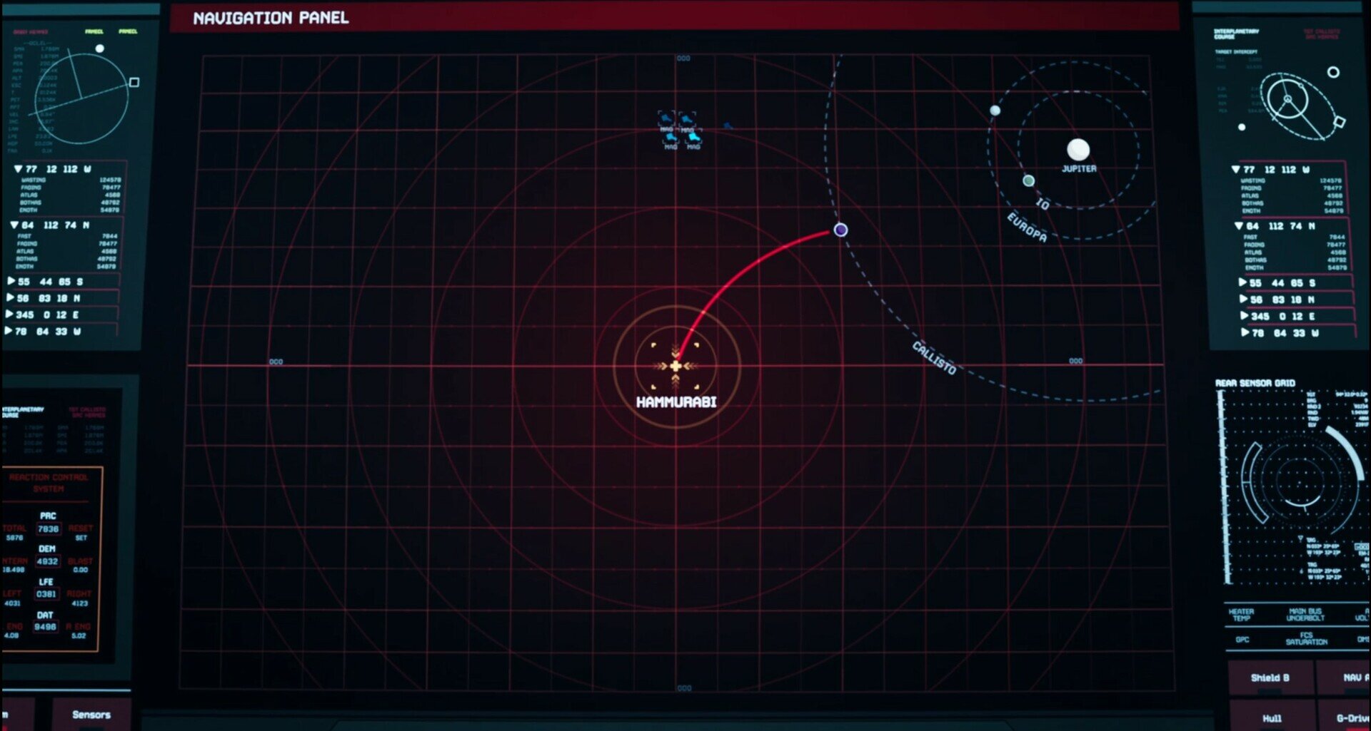
Touch screens
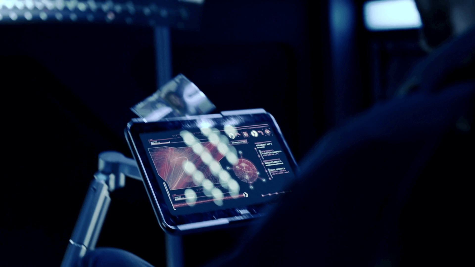
There’s plenty of touch screens and kiosks seen throughout and they are fairly functional with hints of personality depending on the context. It’s worth pointing out an example below of someone using a touch screen whilst wearing heavy industrial gloves, which is a common challenge when dealing with interfaces in space or any other scenarios where the user may be wearing gloves. In those instances, you would normally make the UI slightly larger to cater to the larger touch area or perhaps switch to a more tactile interface. But in this context, I doubt anyone but a site dedicated to HUD and GUIS would notice :)


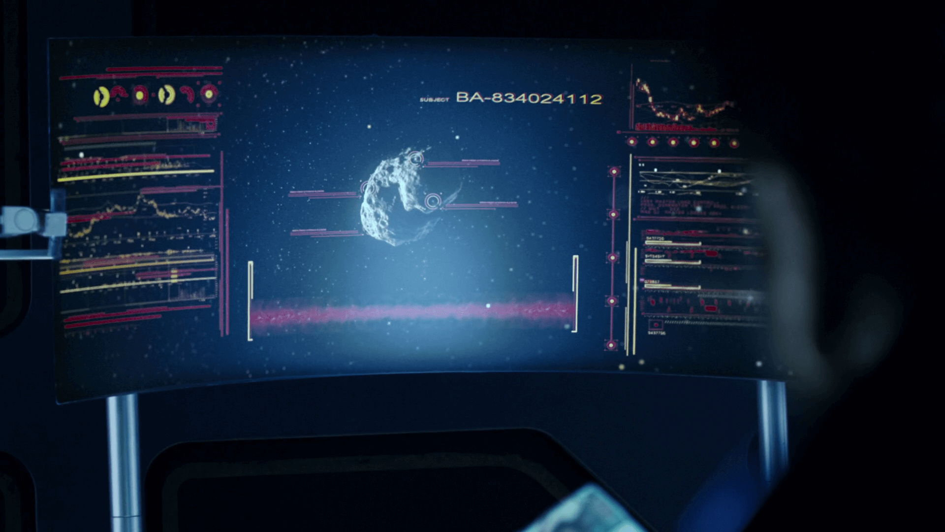
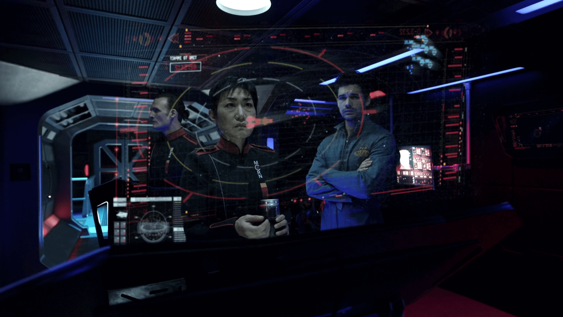
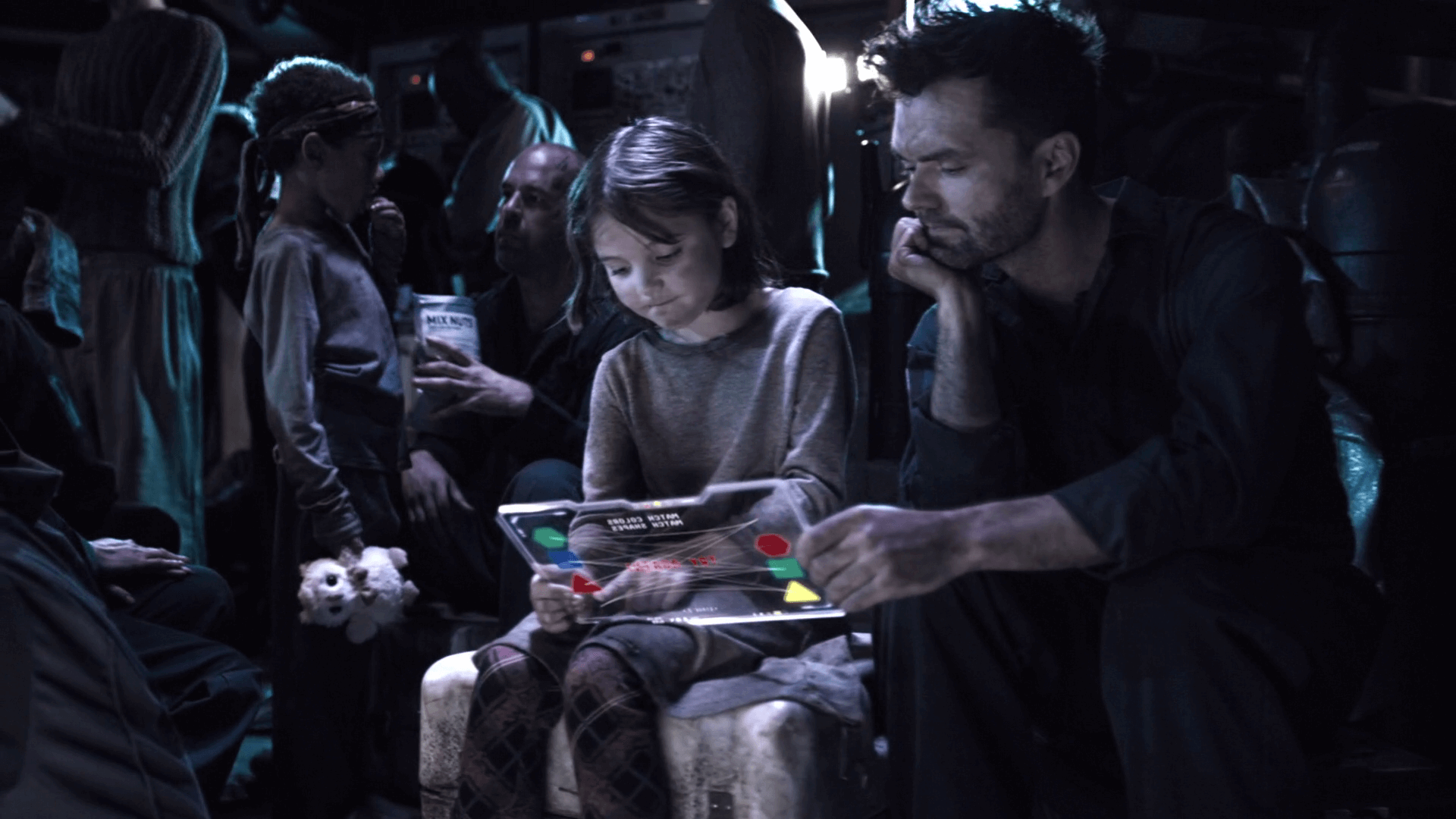
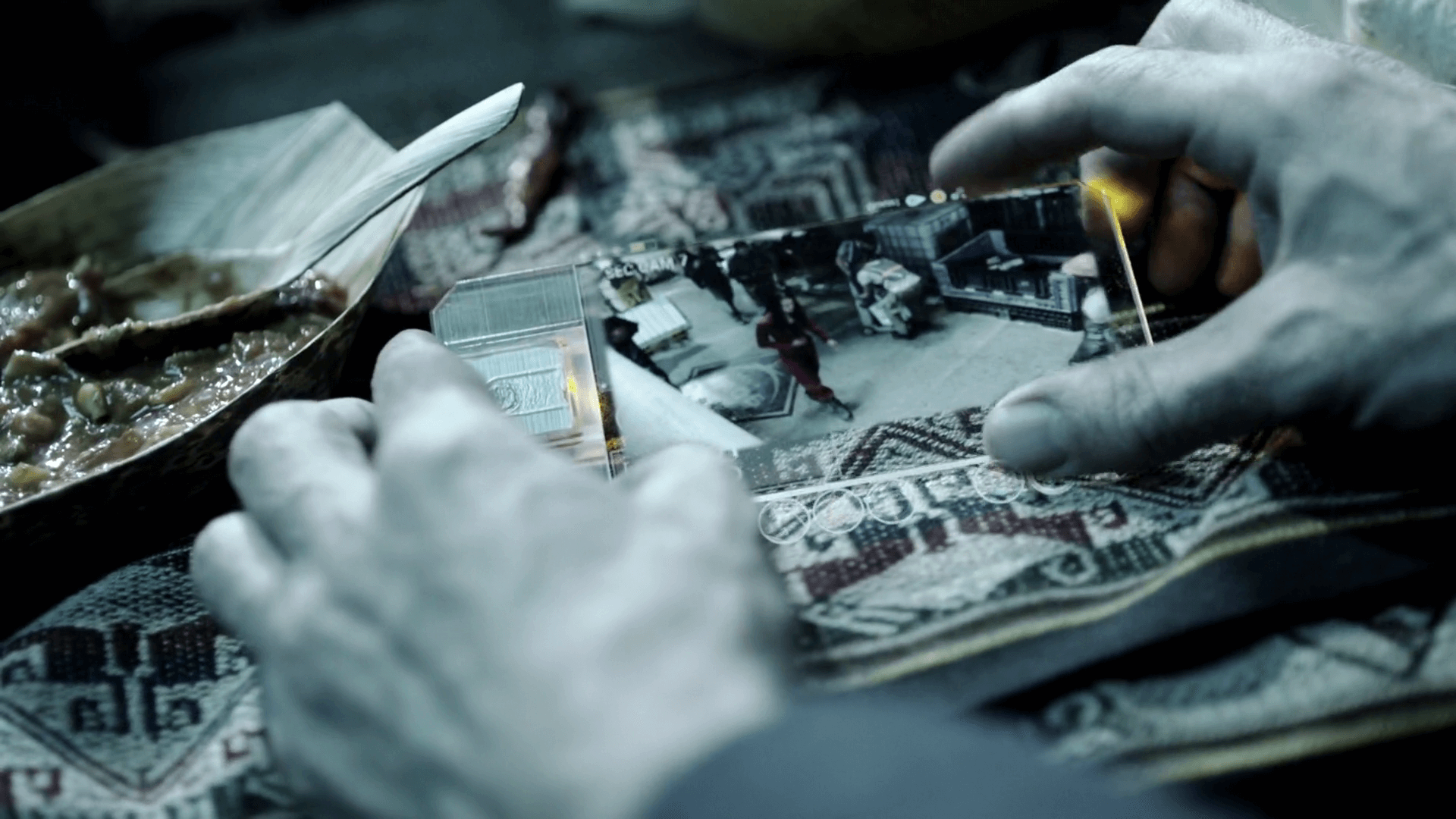
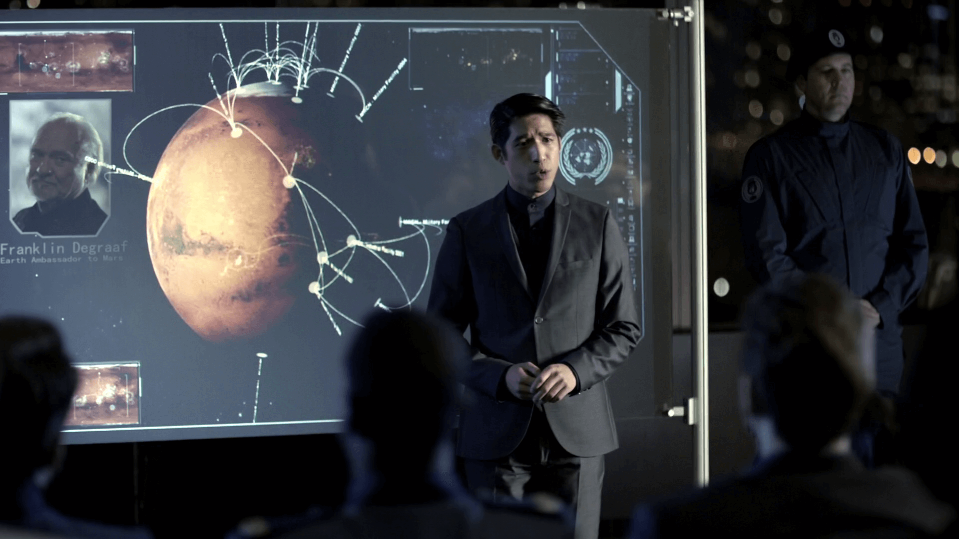
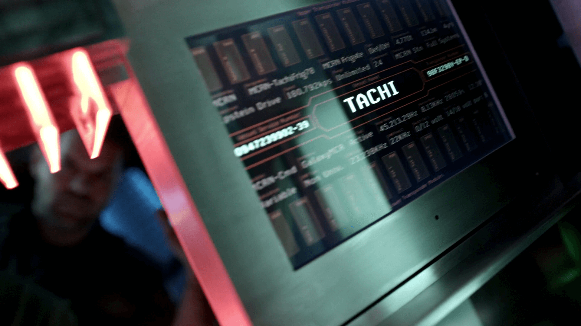
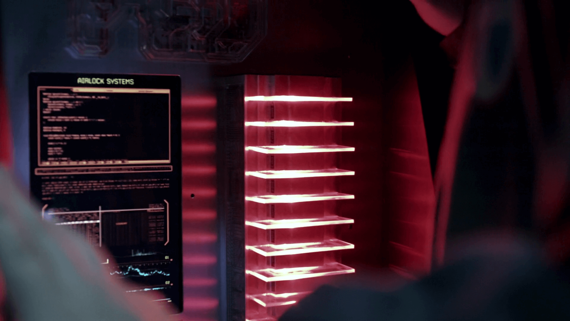
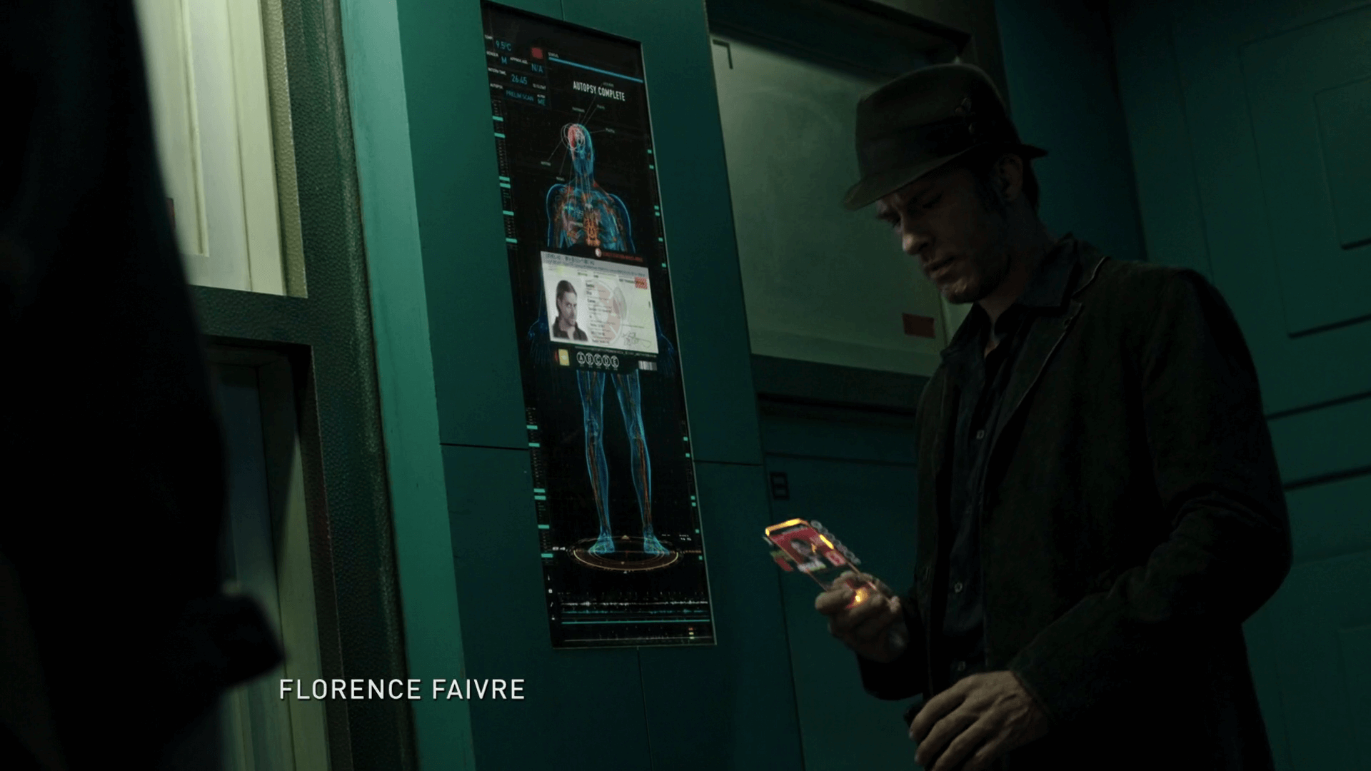
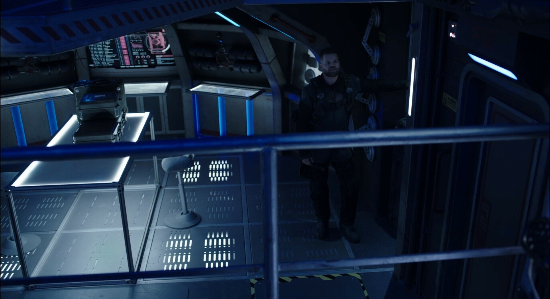
Miscellaneous Displays


Q&A with Rhys Yorke
Motion graphics designer - The Expanse (Season 3 & 5)
Rhys was kind enough to give up his time to share some insights around the making of The Expanse UI suite.
Big thank you to Rhys and congratulations to the whole team for a great body of work over 5 seasons!
What was your role on The Expanse?
I worked as a motion graphics designer in the Art Department, as part of the motion graphics team. I was involved in designing and animating the user-interfaces for the show, and The Expanse has quite a large number of them!
Which season did you work on?
I started on season 3 of the Expanse, and I was brought back in to help with post-production on season 5, in-particular the Razorback. The nice thing is that a lot of the design elements I was able to establish on season 3 have been carried out through the seasons that followed.
Would you mind sharing some rough timings on the project (ie. concept, design, production) to help give an idea of how long things take to produce?
In television, especially if you are creating work to be used by the actors, you do not have a lot of time to break down the script and generate new designs. We had to work smart, so we established style guides that outlined the design language for the various ships and sets, and that allowed us to develop a concept, design and animate the screens, and get it approved and sent to playback so they could test it on set. Often turn-around would only be a day or two.
Who did you work with on the UI design?
There are several talented people on the motion graphics team on The Expanse. Since the show relies heavily on screens to display story elements, the team is larger than a typically scifi show. I had the pleasure of working with Sumeet Vats, Victor Mare, Chris Ouimet, Robert Nowacki, Walter H. May, Colin Graham, and Nick Melia. Our team also worked closely with Naren Shanker as well as the rest of the art department, Ty Franck would also get involved when he was available. Honestly, I have not known a showrunner to be as invested in the motion graphics as much as Naren was on the Expanse, and it made for a great experience.
How did you get involved with the project?
I was working at Ubisoft on FarCry 5, when the motion graphics team lead, Sumeet, reached out to me to see if I would be interested in helping. I was up for a change, and I was a fan of the show (Season 1 was airing at the time) – so I jumped at the opportunity. Initially, I was just helping for a couple of weeks, but they liked my work enough to invite me to join the team, and the guild (Director’s Guild of Canada).
Was the majority of the work done in post production or did the actors have interfaces on the screens in front of them?
The great thing about the Expanse was that the Production Designer, Toni Ianni, was keen on having real interfaces for the actors to interact with as much as possible. This meant that we had the opportunity to build functional interactive screens as well as screens that were triggered by on-set playback. While we tried to give the actors practical screens whenever possible, there were times when a screen couldn’t be completed in the allotted time – either because the story points were not yet worked out, or the animations and timing were just too complex, so a lot of work is also done in post.
Anything else you would like to add?
One of the things with the Expanse was that the Showrunner, Naren Shanker, was very keen on making things as real as possible. What this meant was that any screen should look like it could be functional, and a screen that may have started off as an ND (Non-Descript) background screen could end up as a hero screen. Though this was time consuming, and extra work – I think it was a good call and paid off for the show. We were fortunate enough to have a visit from a former NASA astronaut during season 3 – that discussed with us NASA’s design philosophy. This aligned with what we were working towards on the show, and coming from a military background myself, I tried to leverage as much as I could to adhere to general military design guidelines.
At the end of the day though, the design needs to support the storytelling first. The screens are far from being perfect, the team put a lot care and passion into them. I learned a great deal on The Expanse, and I was happy that I was able to bring a lot of my training, knowledge, and experience to the show.
The following is some of the UI that Rhys worked on directly.
Agatha King
The form factor for this ship UI is really fun. Apparently the design of the Agatha King was influenced by WWII naval battleships and you can see it in the design of the control panels.
I love the small angular panels that sit just above the keyboard, and also how the main screen is short and wide.
The UI design suits the form factor and the context nicely. It’s primarily a clean blue design with minor hints of orange and green for accents.


Bohemoth


Razorback
The Razorback features curved holographic displays, which in the context of a small space works really well. Should the user want to move around the cockpit, they aren’t obstructed by any hardware, they can simply walk through the hologram. It’s also useful in the case of any turbulence, where vibrations or flying objects might otherwise crack a screen. This is a really good use case for holographic displays.


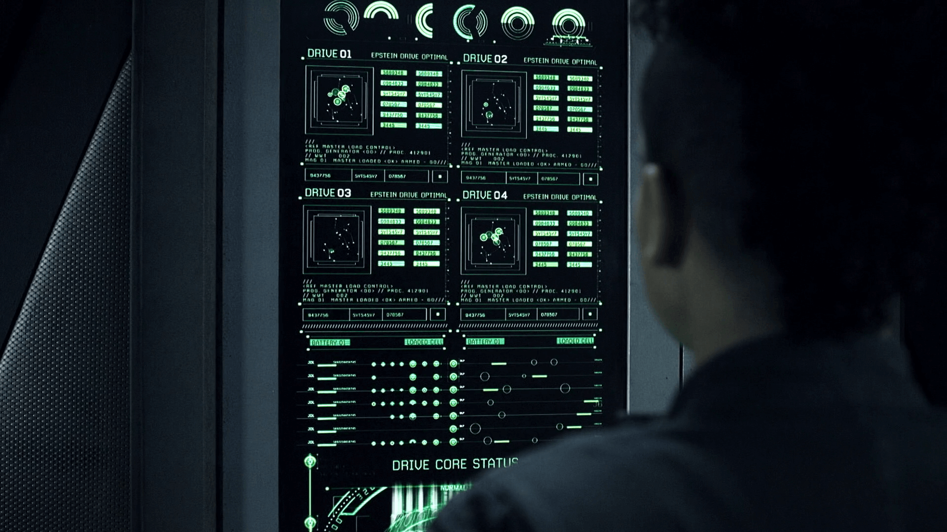
Rocinante
The UI design on the Rocinante gives a lot of personality to the ship. The typography in particular and the command line text gives the impression of an under-the-hood type UI experience. It’s not a polished UI, and sits in the middle of a front-end and back-end experience. It’s an interface that’s built for the crew as opposed to a consumer facing experience, so it’s highly functional.


Overall The Expanse showcases a really well rounded ‘expansive’ suite of interfaces. Big congrats to everyone who worked on the project!