Dr Strange - Medical UI Design by Spov

Not all FUI is about creating grand interfaces for alien ships and space suits, sometimes it's about creating screen graphics for things like mobile phone screens, dialogue boxes or in this case medical procedures.
Here is a montage of the medical screens created for Dr Strange by Spov (Batman - Arkham Knight, Call of Duty: Advanced Warfare, NeuroScouting).
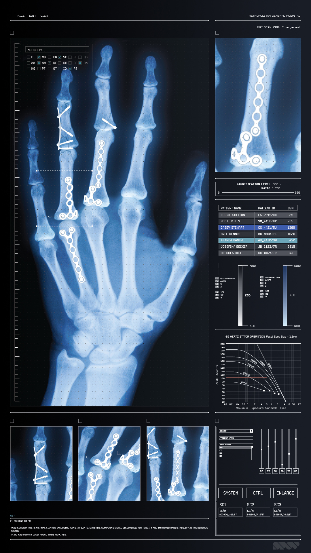
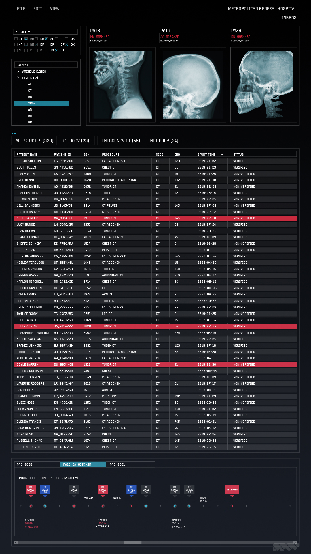
This is a really great example of how much detail goes into these screens sometimes. I'm so glad that Spov has shared this, as it allows us to see the effort required to accomplish the look of the final shots.
Overall there is such a high level of realism to the designs, that you could easily pass them off as real medical interfaces. None of the real medical screens I've seen personally look as good as these. Spov have done a great job maintaining authenticity in the designs whilst making them look modern and visually attractive.
Detail
I love the detail of the anatomy. Particularly the shots with the hand, I don't think it's possible currently to get scans of the anatomy with this much clarity and detail, with the ability to isolate areas of interest. That in itself makes the UI look advanced and at the same time visually interesting.
Animation
It's also worth pointing out the animation. I love the subtle animations that appear over the brain sequences. If you look closely, they move very precisely and the animation shows restraint. There are no distracting elements, only calm movements, much like the medical procedure itself.
Colour palette
There are a few colour schemes here for each of the different screens, and they are all really nicely considered. Firstly the white brain scans with the purple glows are very striking, the supporting colours are quite nice too and together create very stark yet luscious images. Next, the predominantly greyscale palette with the muted red highlights create a very technical, bare-bones look. Finally the hand operation screens feature greyish and blueish backgrounds with muted highlights. I thought the chosen highlight colours were unusual choices, but really suited the design's flat style. I personally love it and think they were very mature choices.
Image gallery


Check it out, Spov really did an amazing job on these!