Star Citizen - UI Revisited (part 1)

Let us revisit Star Citizen, the multiplayer space trading and combat simulation game we previously covered in 2013 (Star Citizen - Developing the HUD).
Since our last review, there have been substantial developments and loads of new content from the development team at Cloud Imperium Games. If you're interested in delving deeper into the UI's creation or the game itself, their YouTube channel is a treasure trove of videos talking about everything from ship designs, interior design, VFX, and much more.
In this review, we'll examine the updated UI Card System, which features a holographic interface that encompasses the player like a 360° desk. Furthermore, we'll showcase cockpits from 45 flyable ships (posted by reddit user: Bulletwithbatwings), diegetic interfaces, and the mining interface.
UI Card system
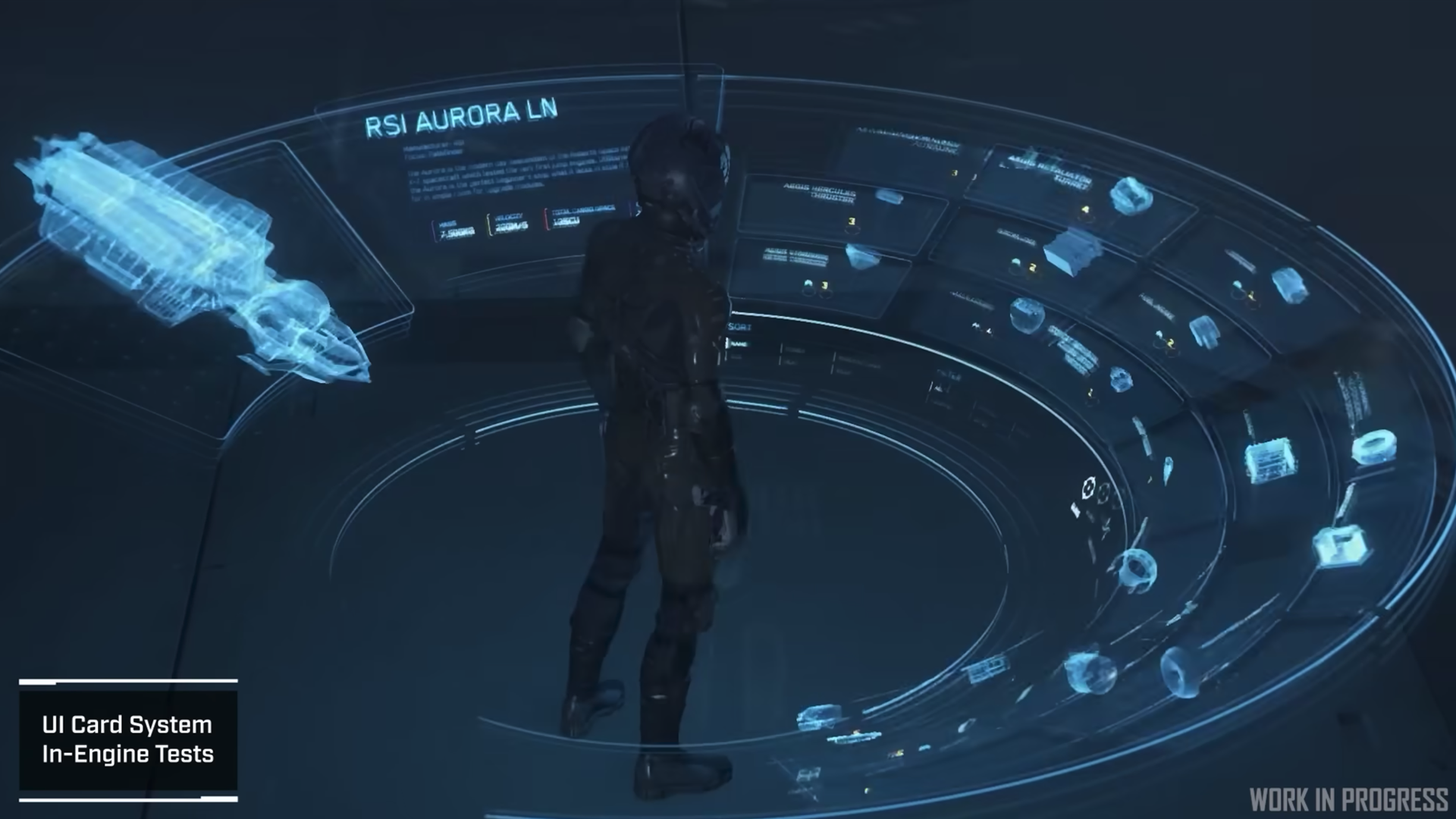
The 360° holographic interface shown in the video is really impressive and could easily be applied to a VR experience. In fact the universal menu on the Oculus VR experience is also curved but covers only about 45°.
The interface is designed to build up around the user as they move into position. The way the content rearranges itself is quite effective, particularly in how newly introduced information seamlessly integrates as additional rows that stack atop existing content.
The interface's limited colour palette aids in comprehension while emphasising current selections, and the use of three-dimensional icons is nice touch afforded in these types of spacial interfaces.
It’s worth noting how the selected items move up rather than being pushed down like a button. This is most likely so that it can remain legible but it’s common for spacial interfaces to bring items of interest closer to the viewer and less important information further away.
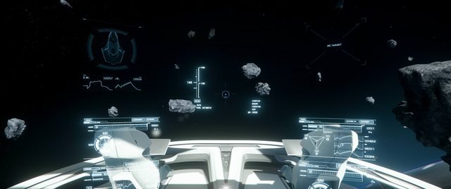
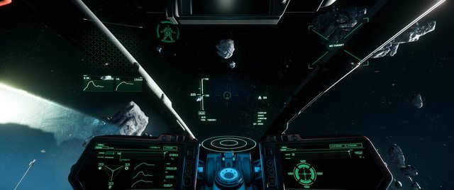
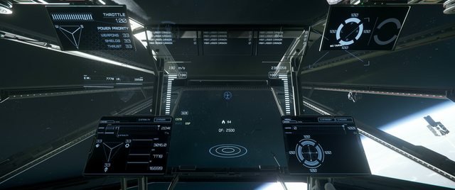
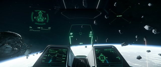
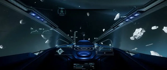
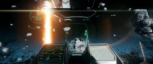
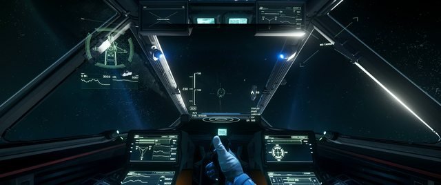
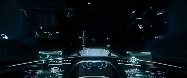
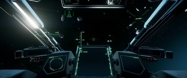
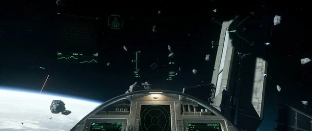
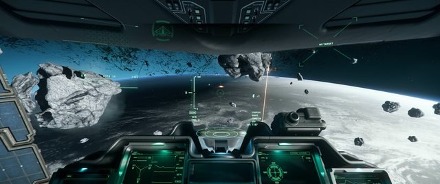
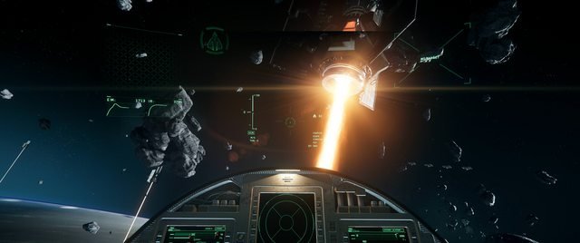
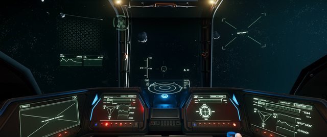
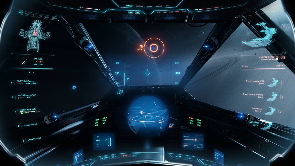
COCKPITS FROM 45 FLYABLE SHIPS
It’s so fun to see such a variety of cockpits from different ships of the same universe.
At first glance there appears to be a lot of unique cockpit UIs but on further inspection, there are actually a lot of common UI elements scattered across the different ships. It looks like each ship uses a different combination of components to create its own set.
This approach simplifies execution while avoiding the creation of a bespoke UI for each ship. The combination of these UI components, together with individualized ship designs, subtle colour variations, and distinct display screens, effectively creates a cohesive and versatile system. This approach to reusing well-designed UI is both clever and efficient.
It's easy to imagine users wanting to pick out a cockpit that reflects their personality or individuality.
Image credit: u/Bulletwithbatwings, posted on r/starcitizen [link to original post]


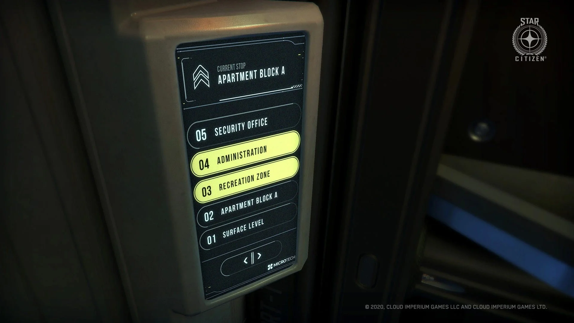
Diegetic interfaces
Here’s a collection of diegetic interfaces from the world of Star Citizen. With such meticulous attention to detail, both within the game world and the UI, it's no wonder players find themselves wholly absorbed in this universe.
Despite their diversity, the designs harmonise as a cohesive entity. They share consistent elements such as shape, outline, iconography, detail, and colour, suggesting a unified design philosophy. These interfaces feel as though they emanate from the same vivid and immersive world.


Mining interface
Here’s a video from the development team talking about their approach to the mining interface. This appears to present an entirely distinct challenge, with its own unique set of complexities.
You can either scrub through the animation or listen to the team's discussion regarding the mining mechanism's objectives and aspirations.
The mining section is from the start to 3:50.
For those of you who have played Star Citizen, we’d love to know your thoughts on the game’s UI design!
Continue our exploration of Star Citizen in this follow up post: Star Citizen - UI revisited part 2.