The Grays by Henry Hobson - HUD design

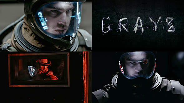
The Grays is a tension filled short film by Henry Hobson which is beautifully shot and features a really cool HUD. The suit itself feels very vintage and textural and I love this contrast with the very modern HUD. Lucky for us, we get to see quite a bit of the HUD and it is exquisite.
The initial boot-up sequence is nice, there's a subtle backlight that flickers on whilst all the elements slide into position smoothly. There's readouts on either side of the helmet that both use fixed column widths. This really looks great and forces an interesting balance of scale, which also sets the visual hierarchy of elements. Realistically this would be a tricky constraint to work around but for this instance it makes for a very unique arrangement. The HUD design is very distinct and relies on neatly locked up typographic elements.
There's a shot near the end where you can see the readouts from the inside of the visor. This gives you a taste of what it would be like to experience this HUD, and it looks brilliant. The readouts are easily readable and look really sexy from up close. I also absolutely love when the colour kicks in, you get to see shades of red and pink, which are vibrant and so pretty to look at.
Check it out, the film itself is so beautifully shot and the HUD is a real standout.


