New Balance spot by Loop

Here's a short spot for New Balance shoes featuring baseball player Robinson Canó, by Loop. The sign off mentions that the shoes are 'Designed from player data' and that is exactly what's demonstrated in the clip. We see Canó go through the motions of preparing for and completing a home-run hit. The spot focuses on the nuances of the shoe and how it caters specifically for the needs of a hitter.
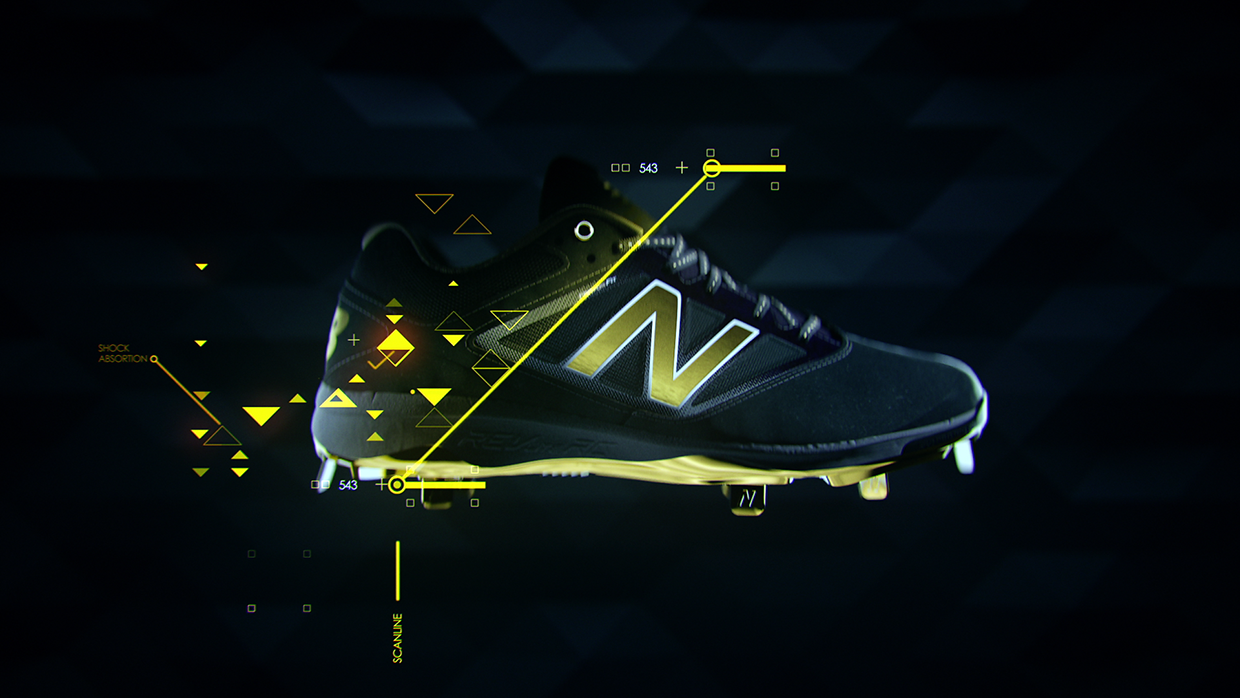
The spot does a really interesting job of visualising the data. They've introduced different ways of analysing information, using all sorts of graphs, which on close inspection doesn't give you many clues into what it's analysing but as a whole it works. It feels busy and complex, but it feels like it's been organised into a digestible format and therefore giving it a sense of authority and professionalism.
I love the design style of the UI. Firstly the colour palette is strong, the vibrant greenish-yellow, supported by the occasional white, set against a dark background is really striking. I like that the yellow is not a solid and flat colour either, instead it varies slightly. The dull yellow, which looks like a less opaque version of the highlight colour is nice too, as it offsets the highlight colour but is not dull enough that it feels dirty. The splash of the fleshy pink also compliments the palette well.
Special attention should be paid to the animation, as it is superb. I love the way the elements transition in and out. I think it had to be interesting because the UI animation was doing a lot of the heavy lifting, taking up at least 15 secs of the whole spot.
Even though it's short, there's a lot of inspiration that can be taken from this. Great work by the crew at Loop!
Here's a link to a another clip for New Balance by Loop that features some GUIs but not as much as the first. I think it is worth sharing too.