Batman - Arkham Knight UI

Here are some UI examples from Batman - Arkham Knight. There's actually quite a lot to show including the development reel, concept reel, wrist-mounted hologram, and the mission select wheel.
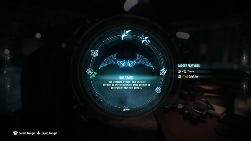
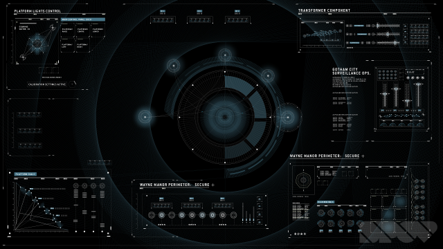
The development reel shown above is by Spov and includes a variety of different interfaces including control room systems, HUDs, maps, corporate systems, as well as some their initial research examples!
It features some beautiful visuals and animation sequences. It's nice to see how the design style is able to stretch across so many different forms. Each of the different examples feel like they're from the same world or OS. The design language and details are consistent throughout.
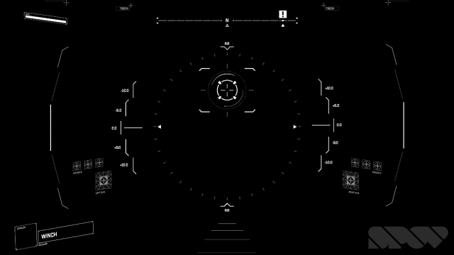
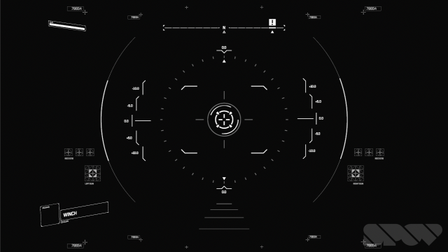
Keep an eye out for the HUDs in the first half of the video, they are particularly nice!
Awesome work by Spov.

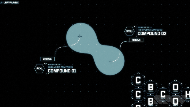
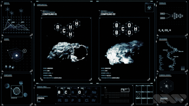
Concept reel
The concept reel focuses on what looks like the interfaces from the Batcave. The design style is a mix of minimalist aesthetics with lots of data, which gives the impression of an organised yet complex modern interface. The style is demonstrated through various security based applications including fingerprint scanning, voice recognition, eye scanning, maps and 3D diagrams. The monotone look also adds to the no nonsense approach of the overall design. The sound design should also be mentioned as it really adds an extra level of personality to the UIs. Really nice work!
Wrist mounted holographic video
Here's an example of a diegetic UI that Batman uses to 'Facetime' people. It's a holographic video that's projected from his wrist or rather his forearm. It works fine but it looks a bit awkward. It would be better if it was projected from his wrist, which would allow him to angle it anyway he pleases. Being on the forearm, you're quickly limited by angle and it also appears quite close to his face.
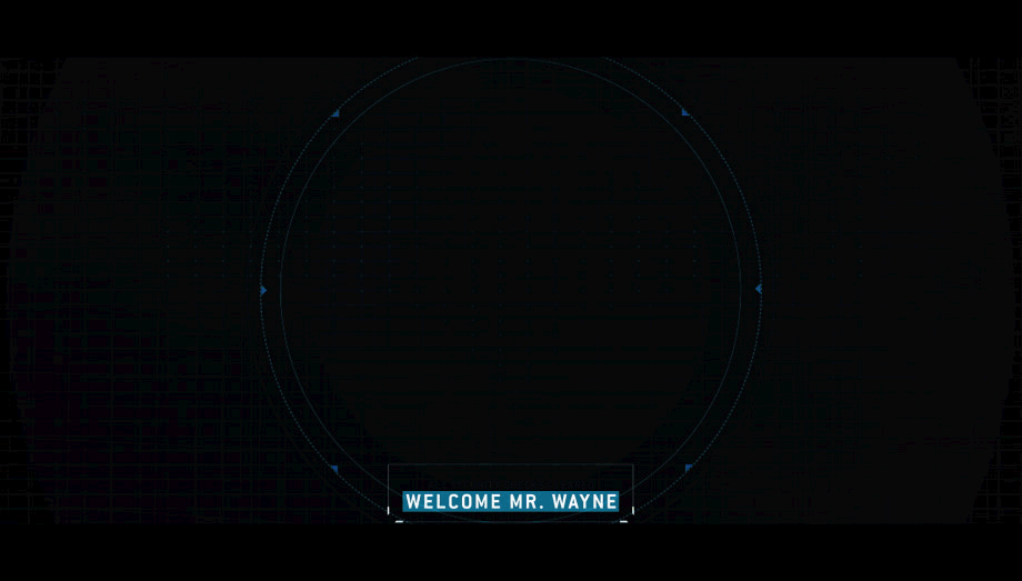
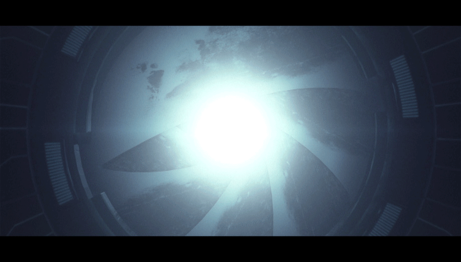
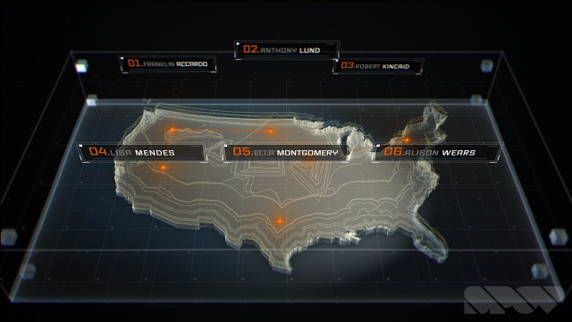
Mission select wheel
Here's a video that demonstrates the mission select wheel, which allows you to highlight points of interest as you glide over the city. The style of the UI elements features a lot of glows and vignettes. There are no hard edges or frames, everything bleeds out in a glow. This helps make the view feel more open and spacious as opposed to boxed in.
The wheel itself looks nice in the way it animates in. The image in the middle also looks great when there's a villain or character inside it. The animation style is quick and helps draw your eye to important areas of the screen.
Image gallery


All in all, the project feels huge but has been handled really well. The outcome is awesome. Well done to the team and make sure you check it out!