Life UI by Spov

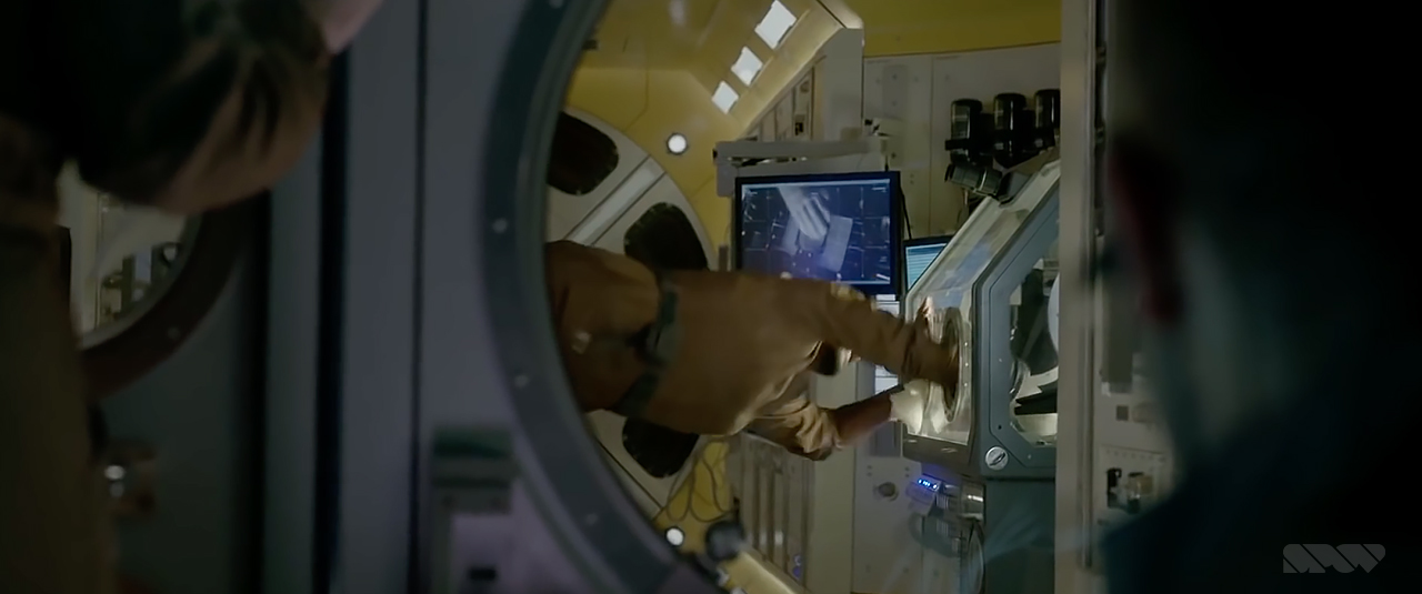
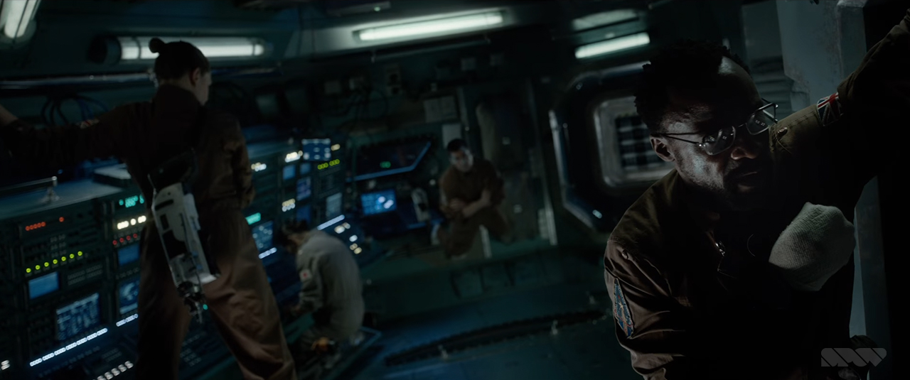
Here is some recent FUI work created for the film Life, by Spov (Dr Strange, Batman - Arkham Knight, Call of Duty: Advanced Warfare, NeuroScouting). The team at Spov were tasked with designing several different sets of UI. One for each of the modules that make up the International Space Station (ISS).
Each UI set is differentiated mainly through varying colour schemes. Universally the designs all basically follow the same rules. This works nicely to establish a cohesive OS that runs the ISS.
Overall the UI can be described as scientific, organised and modern. The design looks as though everything could have been created using Illustrator. The majority of the screens have a clean, vector look to them. There are a lot of lines and shapes but they only use solid fills and there doesn't seem to be any use of gradients. This creates an almost clinical feel, the UI is removed of any decorative elements and instead is more in favour of efficiency.
Spov are very good at using contrasting colours within each colour palette to draw attention to important features. This seems to have been an exercise in making data look sexy without relying on effects, which they have done a great job at!
Congrats guys!