Hawken: Mech HUDs
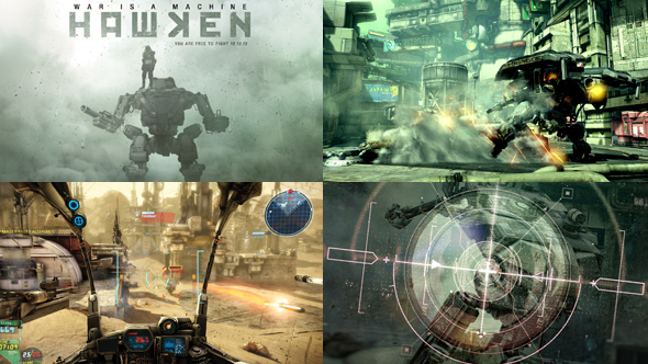
Hawken has been a project I've been following with lot's of anticipation, ever since I first came across it's early gameplay footage. I immediately fell in love with the art direction. The Mechs and the world they exist in is so gritty and beautiful. The world looks futuristic but in a dirty and pieced together way and makes me believe it's been inspired by anime in some way.
Here is a Pinterest board showcasing some of Hawken's Mech HUDs and cockpits. It also turns out that our friend Ash Thorp has been involved in this project as well, contributing some interface work and UI elements for the HUDs, which is also up on the board.
I really enjoyed seeing the cockpits vary from different Mech designs. The HUDs themselves are very consistent across the Mechs, and use a precise, military inspired style. I think the use of yellow as an accent in the colour palette is really clever, as it helps make the designs look very functional. I think the Mechs and the world itself is designed in a similar way, where the focus on function creates a sort of beautiful ugliness. They could have easily gone down the route of having complimentary colours and subtle differences, but I think I'm attracted to the clashing of primary colours.
While researching Hawken I soon noticed that the HUDs in Hawken were a topic of lots of debate. I stumbled on this thread on the Hawken forums, in which some passionate members have taken it upon themselves to design suggestions for improving the HUDs. So cool to see!
If you don't manage to play the game, make sure you check out the videos on their site. Seeing the first person view from the cockpit is really fantastic, the HUDs really come to life, and the framing of the screen makes for a really exciting experience!
Check out our Hawken: Mech HUDs Pinterest board.
***UPDATED***Q&A with Ash Thorp
Ash was kind enough to take some time out of his crazy busy schedule to answer a few questions on his involvement on Hawken. Thanks to Ash for shedding some more light on this project!
1. What was your goal with Hawken?
My goal was to try and nail as many design and concept objectives for the team as I could with the limited time I had.
2. How did you approach this project?
I really love the look and feel of the world that the team at Hawken created. I also love the concept of free to play and how they are building a community of followers and fans. So for this project I tried to focus on matching that level and giving them a level of fidelity to help blend in with the ui of the game. My main objective from Khang Le and John Park was to expire some menu and game ui options. They wanted something with more refinement to give their game a more polished look. I took all the notes in and decided on a very clean and simple grid based militant design system with muted colors to match the world of Hawken. The massive effort they put into the art and design of the world was so great I didn't want to clutter it up with a crazy amount of UI. I provided them with 2-3 different options from the concepts I built along with various HUD options.
3. Did you have any concepts or ideas that didn't make it to the final stages? If so, would you care to elaborate on them?
Sure! I had a very interesting idea on how to animate the overall entry point and feel of the player into the game. My ideas were a bit vast and their awesome design team were a bit far ahead for a total rebuild. Along those lines I had a few really interesting animation ideas for the HUD and concepts that would have been fun to explore. All and all I think I was off and on Hawken for 5-6 days just giving the team concepts and ideas to maybe think about. Time is usually the deciding factor of where things go and how far we can go with building out concepts.
I would like to thank Khang Le, John Park and the rest of the crew at Adhesive games for having me along for the ride. You guys rock!