Retro Digital Dashboards by Daniel Lazo

Here is a cool project by Daniel Lazo (Sight Extended) that brings to life some amazing digital dashboards from 70s and 80s concept cars. Daniel’s project has reignited my fascination with retro concept cars, which has some of the coolest car designs in my opinion!
The design and animation of these retro dashboards are meant to represent the originals as close as possible, based on his extensive research.
These designs just have so much personality, which is sometimes missing in modern designs for the sake of functionality and established behaviours. Whether right or wrong these designs are unique and expressive, and makes me want to jump straight into the drivers seat!
These dashboard designs are so visually striking and really does justice to the beautiful design of the car exteriors.
Check out our previous post on Retro Dashboards
Check out more of Daniel Lazo’s work here:
Daniel’s Behance page
Instagram @thedaniellazo
1988 Chevrolet Corvette
I love the curved bars in this dashboard design. Whether it’s a product of the limited space or a way to emphasise the progression, the slight curve is just instantly more interesting than a straight line. The typography and color palette is so reminiscent of the era. Having the three separate screens also really enhances the nostalgia for this golden age of car design.


1985 Mazda MX-3 Concept
Firstly, what an amazing looking steering yoke! It just screams retro future and exactly what I imagined a ‘flying car’ having.
The predominately green UI puts the tachometer right in the centre of the layout, with a bold gear symbol in bright orange just to the left of it.
It’s such a simplistic looking design, with basically three ‘blocks’ of information. The large car schematic is an unusual feature too and adds to this bold blocky, graphic layout.


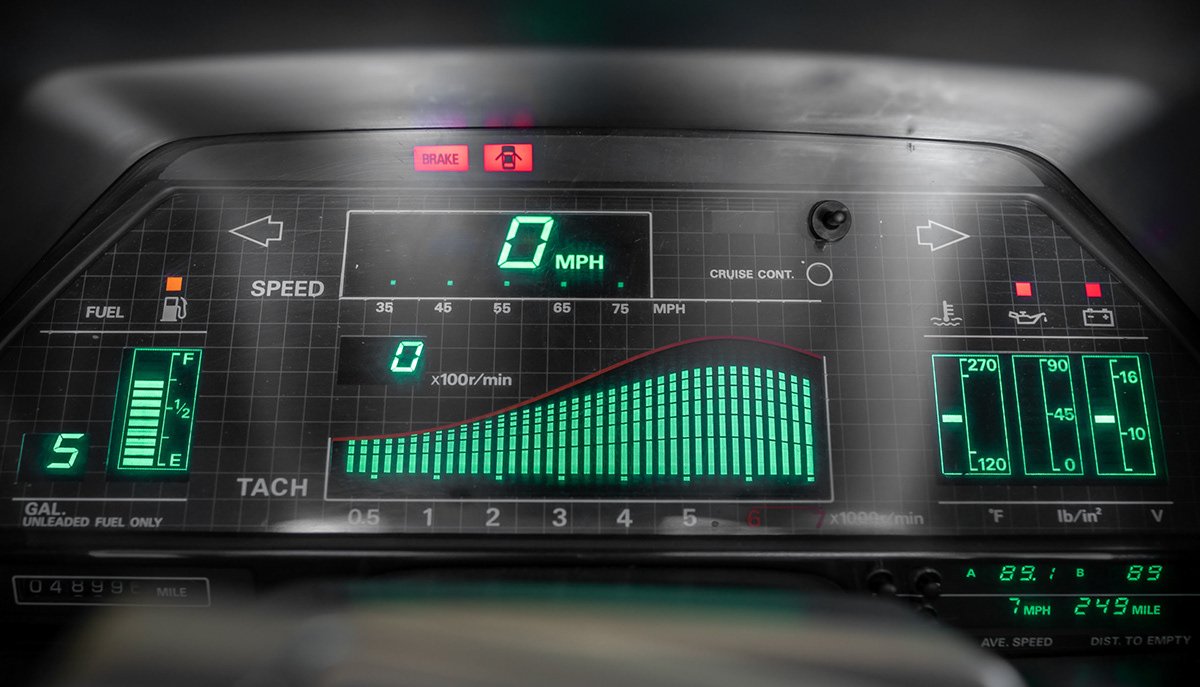
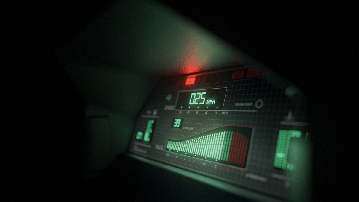
1984 Nissan 300 ZX
This one has such a classic 80s look to it, mainly from the grid pattern and the non-digital decals.
The most unique element of this design would be the wave pattern on the tachometer. Moving like a spectrum visualiser, it really emphasises the speed increase and the red line.
It’s also interesting that this design includes individual meters for the coolant, oil and battery.


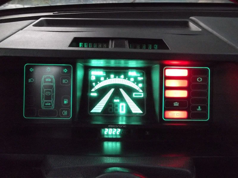
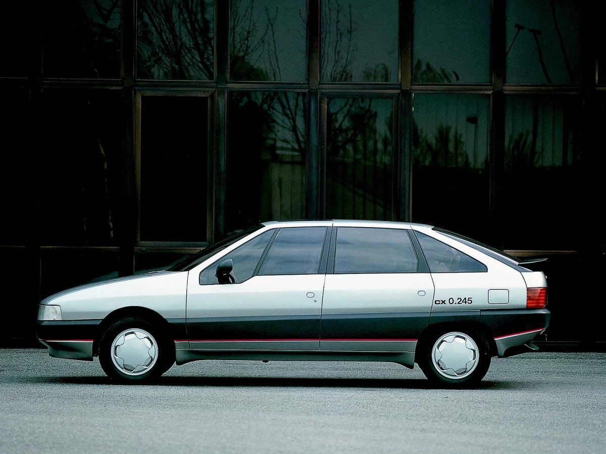
1985 Citroen BX Digit
This design looks like something you’d expect to see in the original Star Wars films. The icons surrounding the car schematic is a really neat look, and it seems like the individual functions are located around the car as you would expect to see them ie. headlights up front, petrol near the rear.
In contrast to the other tachometer designs, the bar gets smaller as the speed increases. Instead it’s moving into the distance, which is a pretty cool visual. It almost enhances the feeling of going fast and has the sense that you’re pushing your car further and further.


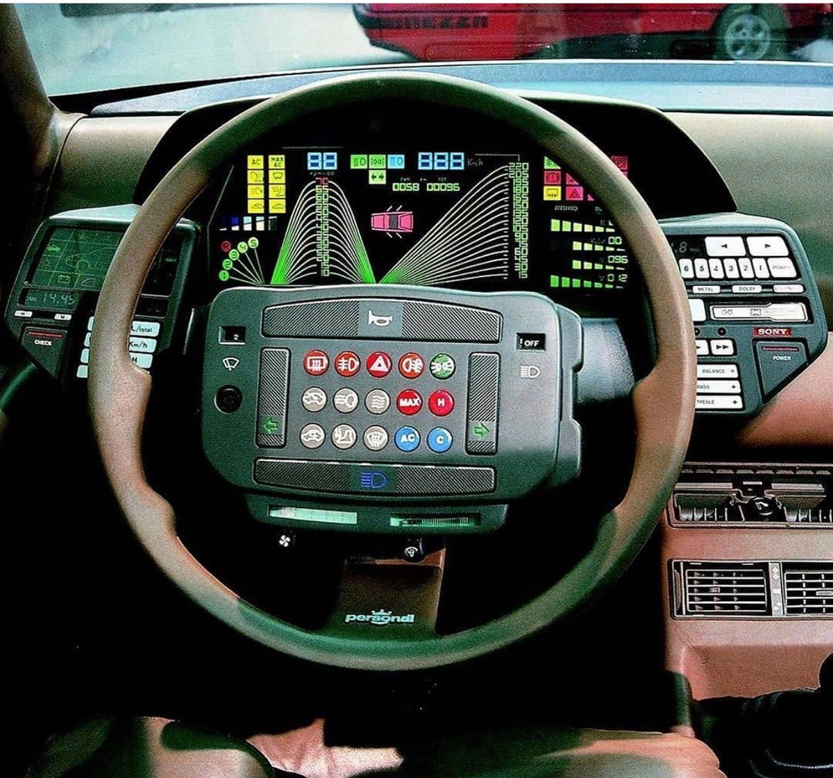
1982 Lancia Orca Concept
The interior of this car is just insane, it’s like you’re in a cockpit of a space shuttle. Not only does the steering wheel have more buttons than most cars, there’s even more buttons off to either side with the tape deck and extra control panel with what looks like the car schematic.
The UI is one of the coolest and the one with the most radical colours. I would love to know what inspired the line graph style design and the thinking behind it. It’s so visually interesting and does at a glance give you the sensation of building up speed.
Even the way they displayed the gears shifting is fun. This design is just packed full of personality. The shape language used in this dashboard is the most unique in my opinion.


Lamborghini Athon / Volvo Tundra Concept
This dashboard design was actually featured in two car designs. Definitely the shortest and widest layout of the bunch, this design really stretches out the individual graphs.
The tachometer is not the most intuitive design but it seems like the horizontal axis is speed, the vertical axis is rpms and the five lines are the different gears.
It’s interesting how the limited space has been used and how the speed reading and grid of icons has been locked into the unused area of the tachometer.
Overall, the design follows a pretty neat grid layout and presents itself as a fairly organised dashboard.


