Apple’s Liquid Glass
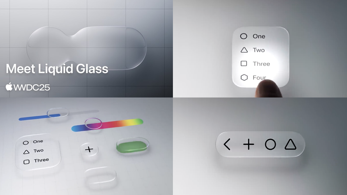
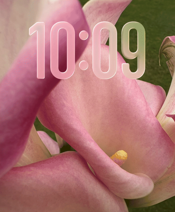
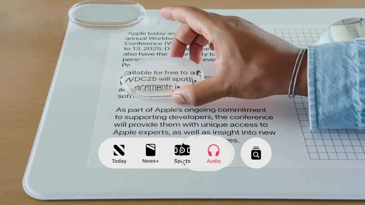
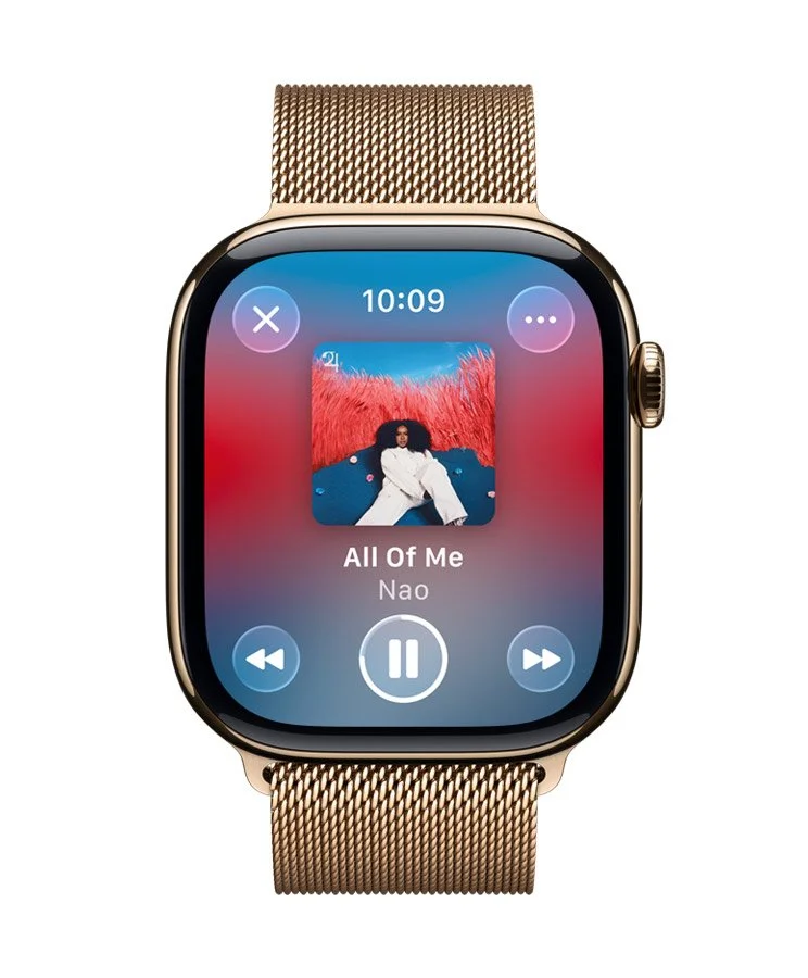
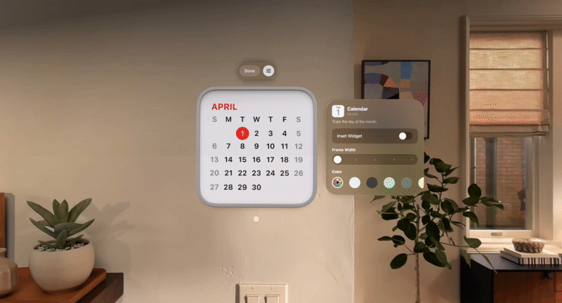
Here’s a look at Apple’s Liquid Glass UI, showcased at WWDC 2025. Reviews have been mixed, with some praising its visual ambition and others highlighting accessibility concerns, even likening it to Windows Vista. Whether you're a fan or not, there’s no denying it has sparked important conversations in UI design.
Personally, I see it as a promising move. It’s encouraging to see a major industry leader putting renewed value on visual expression. Over the past few years, UI design has become highly standardised, heavily influenced by established systems like Google’s Material Design. As a result, many interfaces have started to look predictable and, frankly, a bit boring.
It’s helpful when an influential company does something differently. It sets a precedent and opens up new conversations. For instance, the dynamic corner radius would rarely make it into serious design and development discussions. The value is hard to quantify compared to the effort required to implement it. But now, Apple has made it tangible, shifting what’s considered impossible into the realm of the plausible.

Liquid Glass also signals a shift away from older technical constraints. Remember the rise of flat design? It was a direct response to the limitations of early smartphones, chosen for its scalability and lightweight performance demands. In contrast, Liquid Glass showcases real time light rendering, something not feasible on consumer hardware a decade ago.
This brings up some interesting questions. For example, will we be seeing more UI that's inspired by what you would normally find in game engines, reacting dynamically to its environment? As spatial interfaces become more common, especially on platforms like Apple Vision, it seems likely that game like UI could shape the next evolution of interface design.
(UPDATE) - In light of Apple’s Liquid Glass, Figma has released new Glass effects. Check out this Glass Effects Playground file to play around with it.