Cyber City Odeo 808 - Cyberpunk UI

Here’s a look at the FUI of Cyber City Oedo 808, a gritty cyberpunk anime full of retro-futuristic designs. From car dashboards and cockpits readouts to police files, and schematics, these interfaces play a key role in shaping the world and its atmosphere.
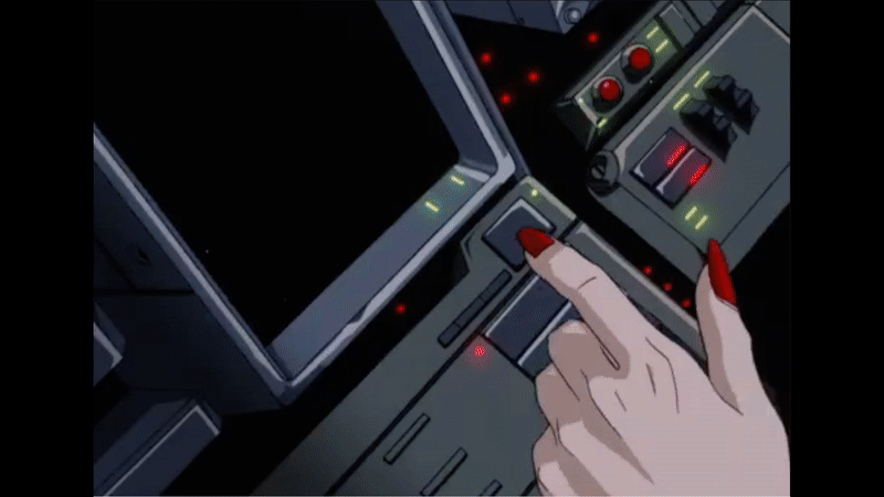
Dashboard and cockpit UI
The designs are wonderfully abstract, using lines, shapes, and motion to suggest complexity without over-explaining. Much of the detail is implied rather than shown, and that restraint adds to the aesthetic. Animation does a lot of the storytelling here: the pacing, the rhythm, the manic flickering during tense moments, all of it conveys mood and urgency without a single word. The car dashboard in particular, is so full of personality.


Police files
The police systems use a distinct and well-balanced colour palette, cool blues and white for type, with turquoise, deep pink, and red as accents. It gives the interface a clean yet stylised look that feels both official and futuristic. The top-down wipe transitions are a nice touch too as it subtly hints at older technologies and adds to the retro future aesthetic.


Computer interfaces
Here’s a mix of screens that involve hacking, mapping and simulations. The screen designs really capture the retro future feel thanks to the fonts, low resolution and animation style and could easily fit into the same timeline as Blade Runner or Alien Romulus.


Handheld UI
This is a really fun device that has a large screen up top for visuals and a secondary screen below for supporting details. The controls at the bottom are reminiscent of early ’90s Japanese tech and really adds to the device’s retro-future appeal.


DNA sequencing
These screens give off a distinctly scientific feel, thanks to the combination of complex diagrams, no-nosense typography and basic animation.


Interface control panels
The interface controls are often complex, built from clusters of small details and elements that sit flat on the console surface. Instead of a standard keyboard, the layouts use generously spaced-out symbols that span across a large panel. The designers did a good job of suggesting complexity through the use of lines and irregular shapes.


Targeting UI
The design of this targeting system is pretty unique. Firstly, it’s not often that you see a serif font used in a high-tech interface, like the word ‘TARGET’. The triangular layout of the callout text is also unusual. Not sure I understand the logic behind it but stylistically it’s very cool and adds to building the design language throughout the world.


