Andor Season 2
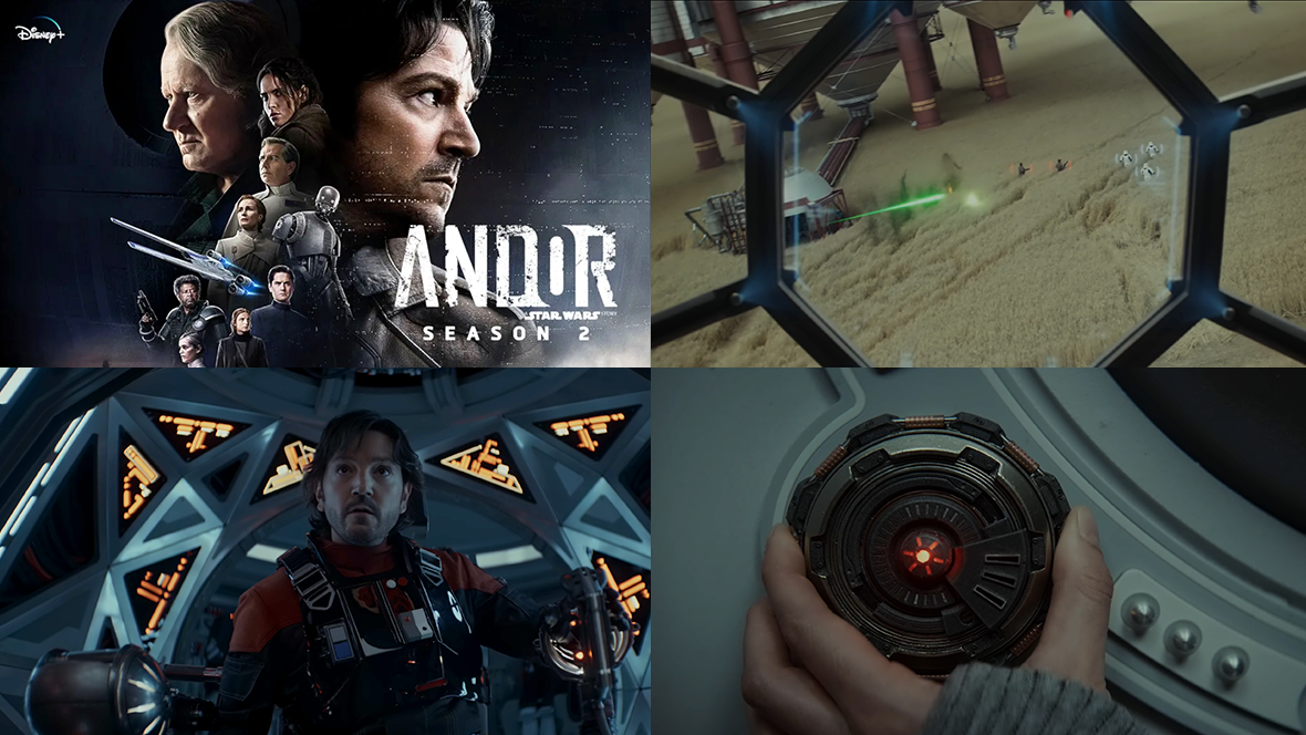
There's a lot of great FUI design to explore in Andor Season 2, by the talented folk at BLIND LTD, including:
TIE Fighter cockpit displays
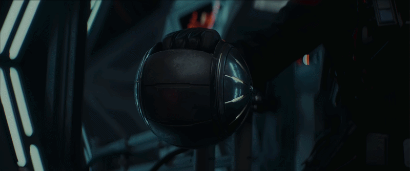
targeting scopes
industrial equipment
medical devices
tablets
espionage tools
desktop computers used throughout the Empire
Each planet introduces its own flavour of technology, but a consistent visual language helps tie everything together and makes it all feel unmistakably Star Wars.
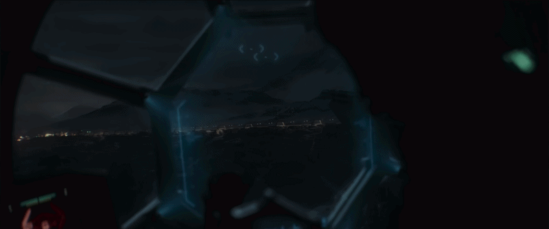
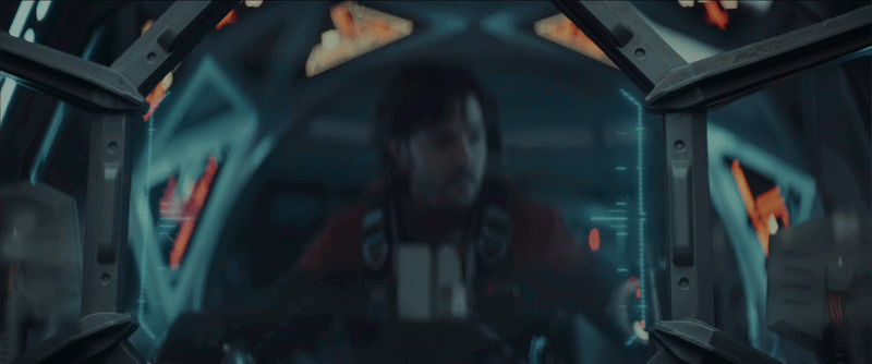
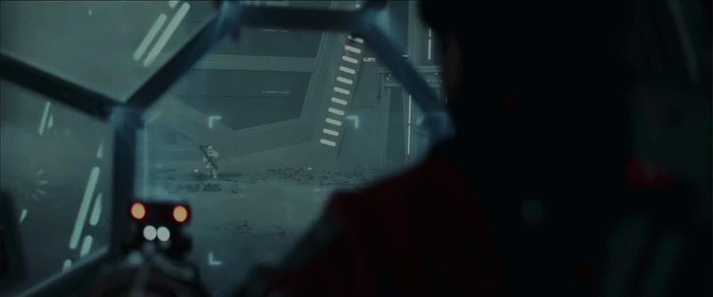
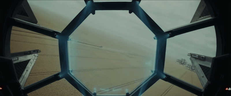
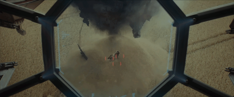
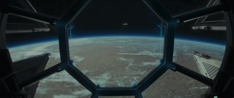
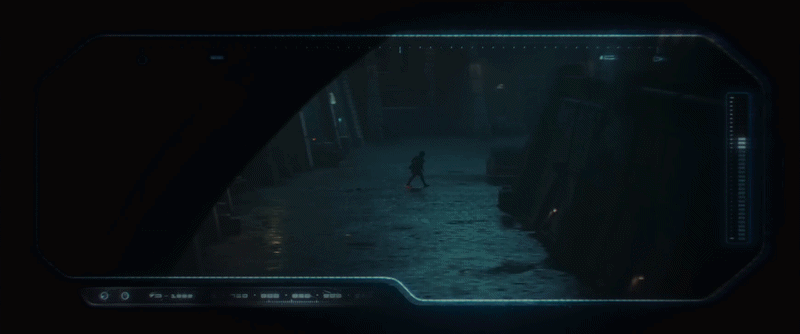
TIE Fighter cockpit displays
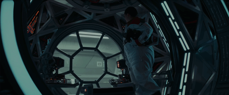
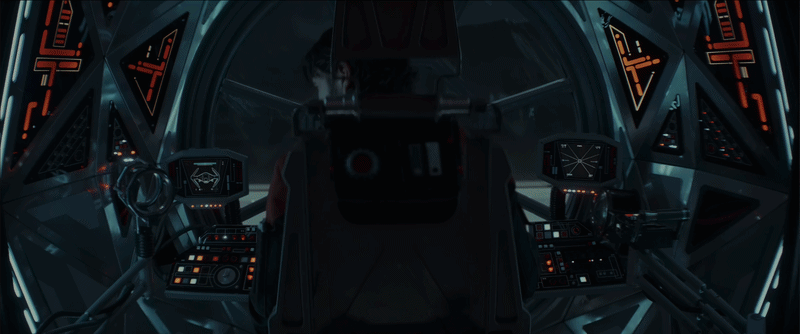
The TIE Fighter cockpit displays are some of the most interesting interfaces in the series. I love how the main display is framed within a hexagonal screen and how the UI wraps around it. It creates such a unique look for the TIE Fighter.
The light blue UI colour looks great against darker backgrounds, although it struggles slightly when displayed over brighter scenes. It feels like a good candidate for an automatic light and dark mode. One of the most dramatic moments is when the entire display shifts to red.
I also love the triangular panel layouts. They may not be the most practical in the real world, but they immediately make the cockpit feel sci-fi and alien.
The controls feel daunting at first, which fits the moment where Andor gets into the ship for the first time. It looks unfamiliar, but then he realises it’s just like a motorcycle-style throttle, something familiar enough to figure out quickly.


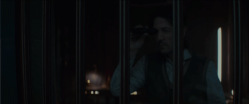
Analogue devices
It’s good to see a few analogue devices in the series. There’s something great about seeing analogue devices reimagined in a futuristic setting. I'm sure the set department would have had a lot of fun with these!
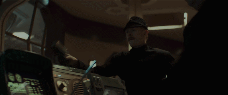
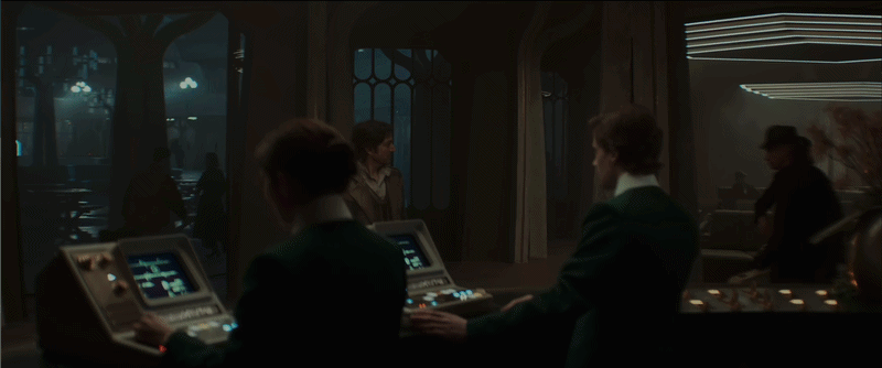
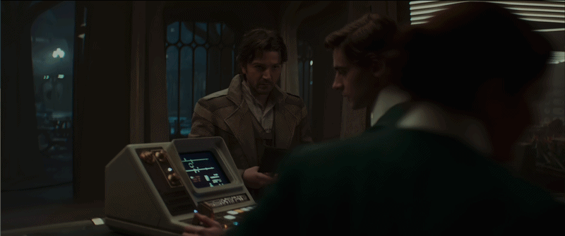
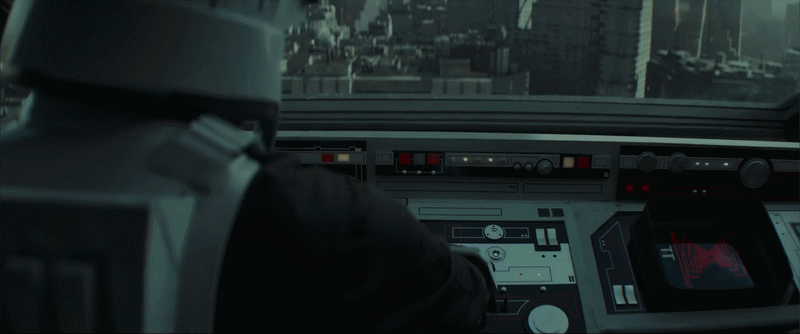
Desktop devices
The design of these desktop devices is great. The screens feel very lo-fi, with unusual layouts that don’t try to mimic modern interfaces. The controls look a bit like an old NASA command centre aesthetic, using dials, knobs, and backlit LED buttons instead of keyboards (See Alien Romulus).
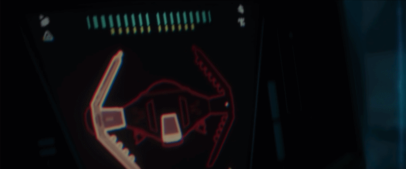
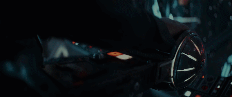
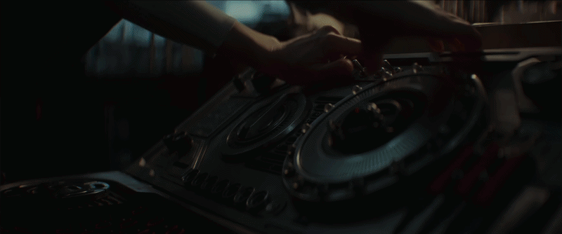
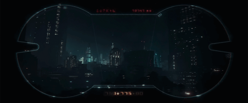
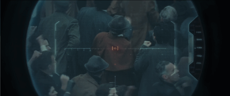
Viewfinders and scopes
The viewfinders have very interesting shapes, and the scrolling numbers feel reminiscent of old rangefinding equipment. The weapon scopes feel slightly more advanced and modern in comparison, which creates a nice contrast between an everyday item and a specialised weapon.
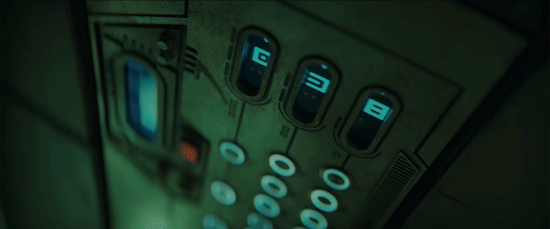
Elevator UI
An elevator is something that feels universal, it goes up and down, and the scrolling panel immediately communicates that motion.
What makes this interface work is how it suggests a familiar function, then adds details that make it feel different. The numbers are split into three separate slots, and the buttons seem to be mapped to those slots, making the display feel both familiar and alien at the same time.
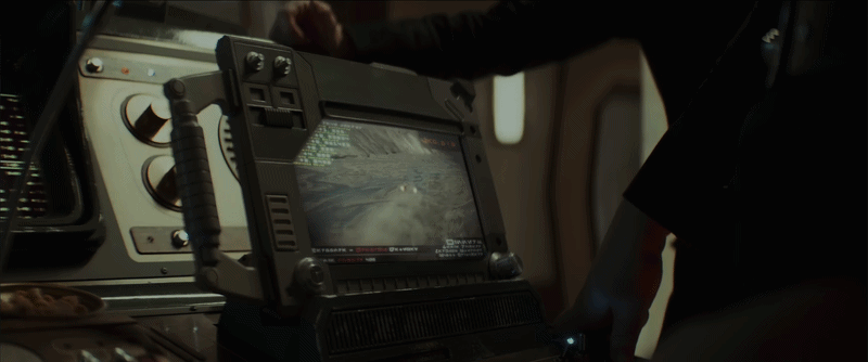
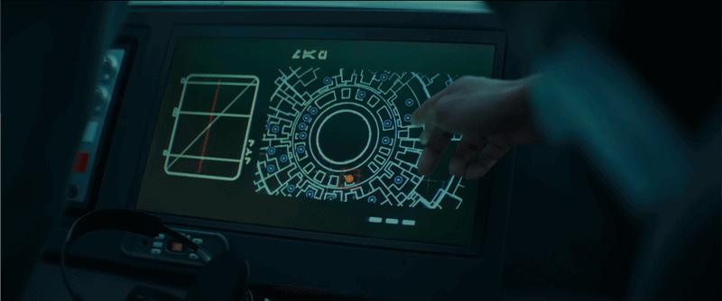
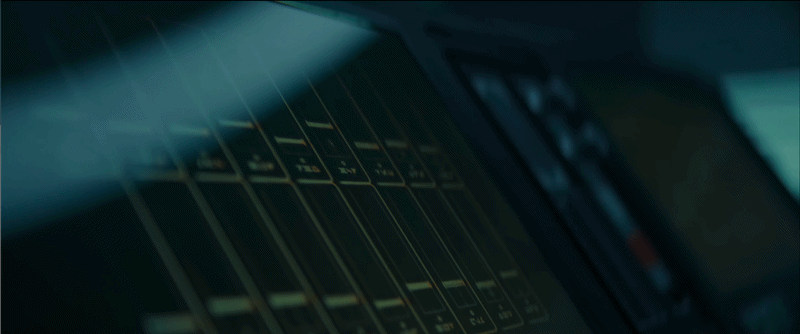
Rhydonium fuel device
This display feels much more utilitarian, like something you’d expect to see on industrial equipment. It’s clearly designed for people who know what they’re doing, with an interface that assumes a level of expertise rather than explaining itself.

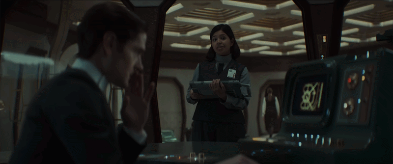
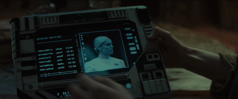
Handheld tablets
The tablet designs are very interesting. They use a format that already feels naturally useful, but push it in a different direction. It feels like what a tablet might have looked like if it had been designed in the 80s or 90s.
The interface feels restricted by the casing itself, with panel layouts dictated by the physical form rather than a clean digital grid. The buttons are basic, and the tablet itself is really chunky, and a bit cumbersome. But that’s part of what makes them great.
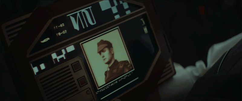

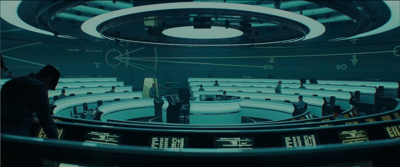
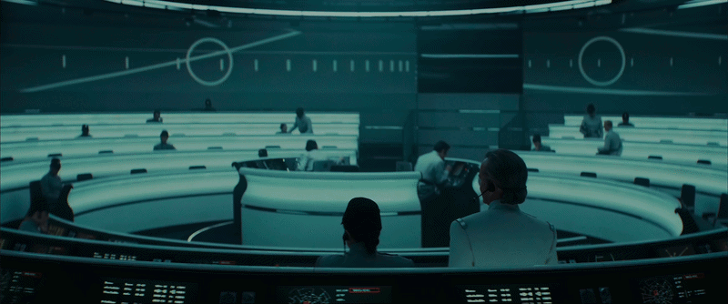
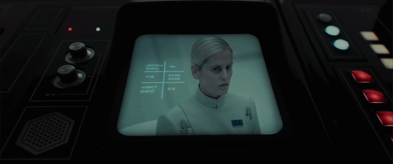
Empire OS
Here’s a nice glimpse into the operating system used within Empire headquarters. It feels clean, minimal, and almost clinical in its presentation. Everything is neat and tightly controlled.
The colour palette is very restrained, mostly black and white with touches of red, clearly aligned with the Empire’s visual language. It feels intentional, almost sterile, which reinforces the sense of order and control.


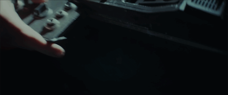
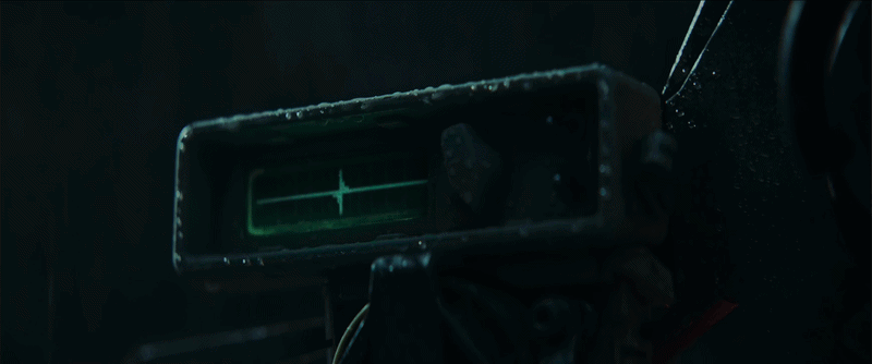
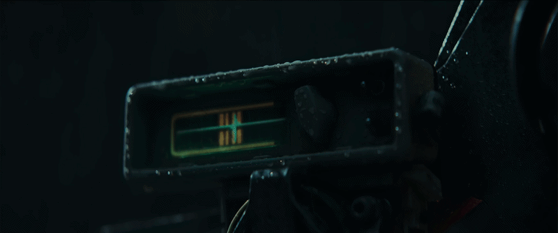
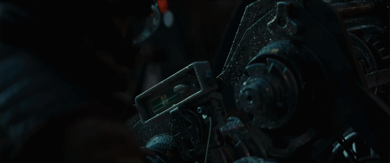
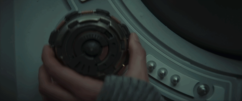
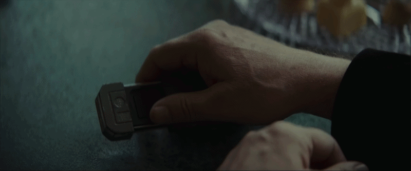
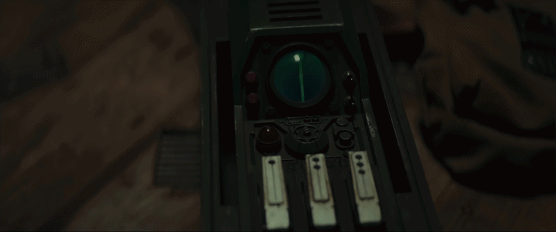
Various espionage tools
The espionage tools are really interesting, almost custom-made devices that don’t sit neatly in any single category. Each one feels like it’s built for a very specific function.
The code-breaking tool in particular has a strong presence. It feels foreign at first, but you could probably guess what it does just from how it behaves. Its rotating elements makes you think of combination locks, and the light turns green once it’s complete.
I also like the signal detecting tool which activates with what looks a bit like the HUDS+GUIS logo :)


Med-bay UI
The medbay interfaces are brutally minimalist, showing almost only data. They strip everything back to the essentials, with very little visual noise.


