Google Material 3 Expressive
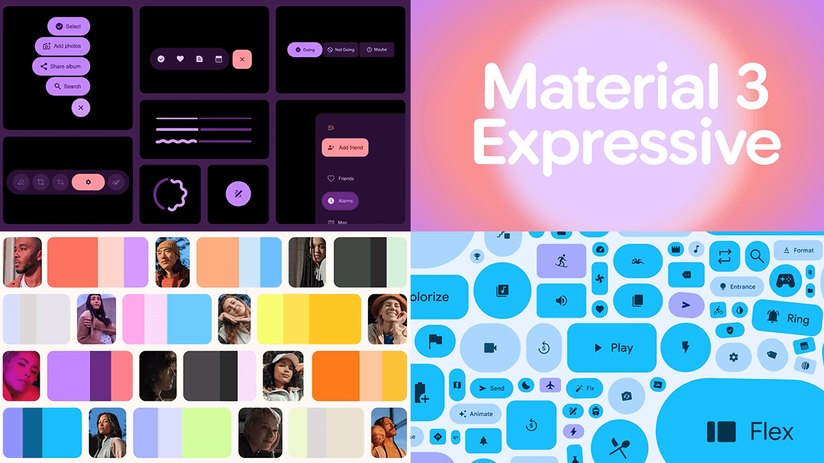
Continuing on the topic of UI systems, here’s a look at Google’s Material 3 Expressive design system. The past decade has been dominated by extreme minimalism, so it’s refreshing to see an update that doesn’t strip things away, but instead brings personality, variety, and more human qualities back into interfaces.
Material Design has long been celebrated for its consistency. But consistency can lead to sameness. Many apps and interfaces began to feel like interchangeable containers, lacking personality.
Expressive feels like a deliberate evolution. It embraces playful typography, stronger motion principles, and colour systems that give interfaces character and encourages individuality.
It also highlights an interesting pattern in design, where a wave of restraint is often followed by a wave of expression.
What I really like is its emphasis on how interfaces feel, and its focus on bringing emotion into the experience.