The Silent Sea

The South Korean Netflix series The Silent Sea is packed with FUIs, from holographic displays and weapon UIs to handheld scanners, mobile interfaces, and control panels.
I was very interested to see FUI designs from a Korean production. Korean characters tend to be more compact than English, providing designers with a bit more breathing room in layouts. That said, I was surprised to find that many of the interfaces were in actually in English.
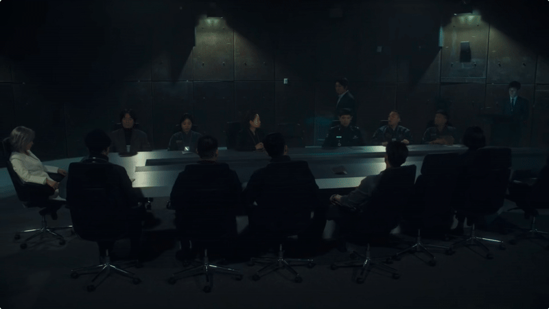
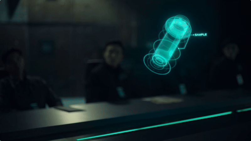
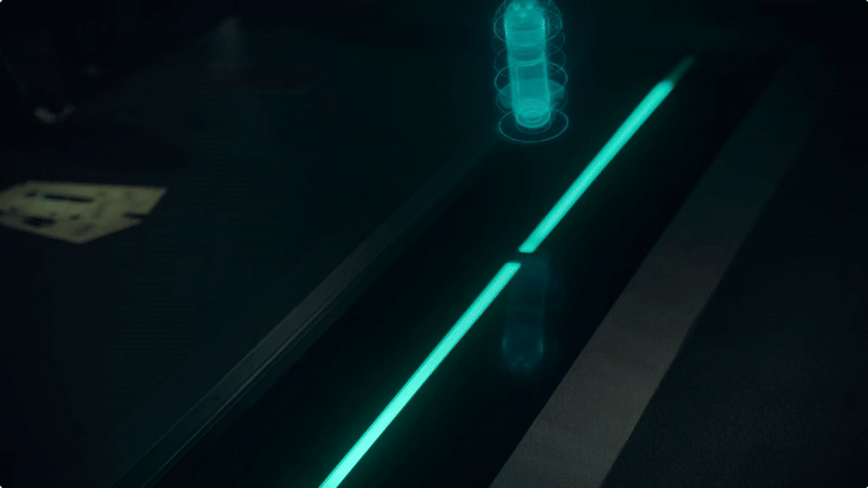
Boardroom hologram
The rotating hologram works beautifully in this boardroom setting. What an engaging way to talk through a mission. You’d structure presentations differently if this technology were available, shifting focus between the holograms and the speaker and choreographing moments of attention. It would be even more engaging if it were interactive, the ability to rotate, zoom, or highlight sections in real time would make for an incredibly immersive briefing.
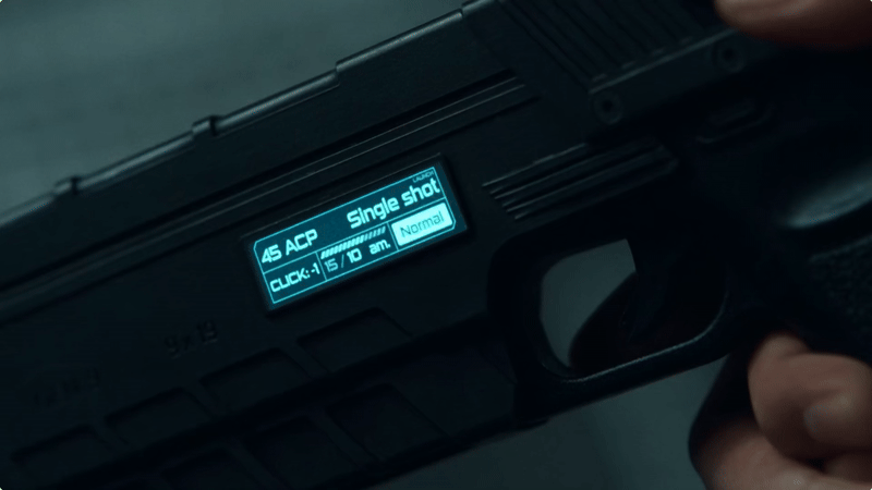
Gun UI
There’s something about having a display on a gun that makes it feel instantly futuristic. Here, the UI lets you see ammo counts and mode settings at a glance and even switch the weapon to fire a tranquilliser.

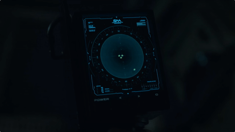
Scanner
Here’s a classic sci-fi horror trope, a scanner that helps detect missing crew members or other lifeforms. Similar to Aliens, it serves a familiar narrative purpose, but The Silent Sea uses a high-fidelity display as opposed to a low-fi aesthetic. Check out (Alien: Isolation and Alien Romulus)

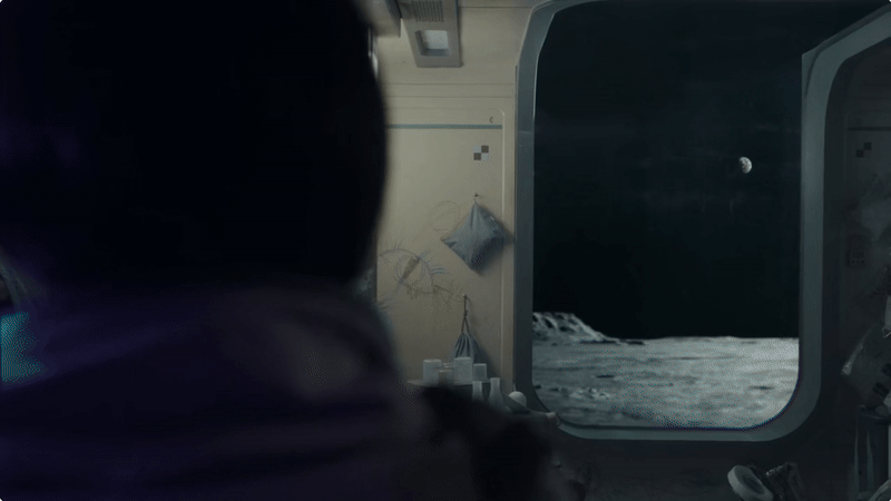
Window display
Here, we see a window looking out onto the surface of the moon, which tints to become a display. While it looks like a classic sci-fi interface, this kind of technology is available today. Smart glass and tintable surfaces are becoming more common, so what feels futuristic in the show might not be far from reality.
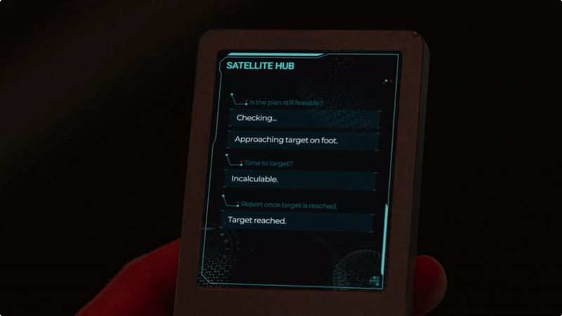
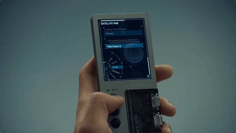
Mobile device
This one is a bit strange, it’s hard to see how the user could type messages using just three buttons and no keyboard. There is a suggestion wheel, but having to tap repeatedly to cycle through options seems tedious. That said, the interface probably isn’t meant to be scrutinized closely or looped over repeatedly. Viewed in context, it reads as something “from another time and world,” reinforcing the sense that this is technology shaped by its own unique environment.
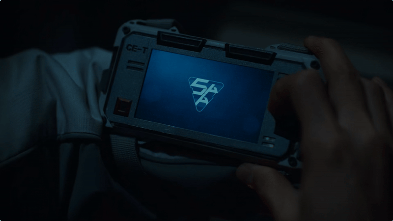
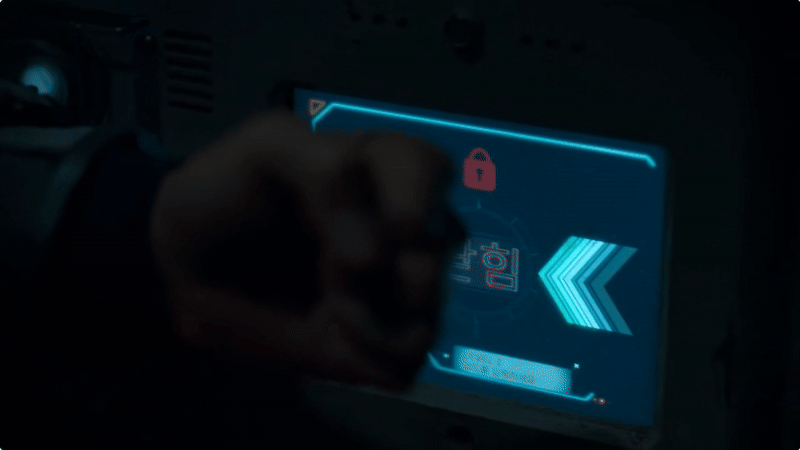
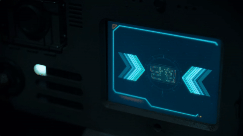
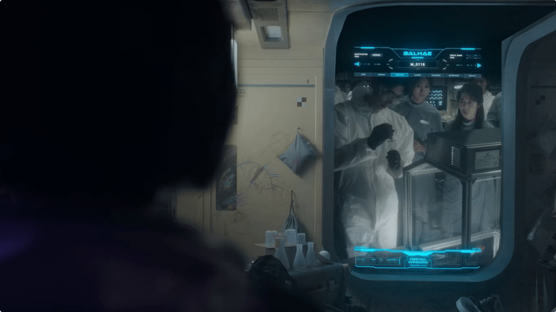
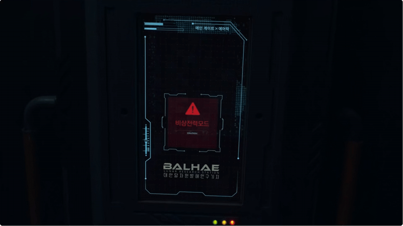
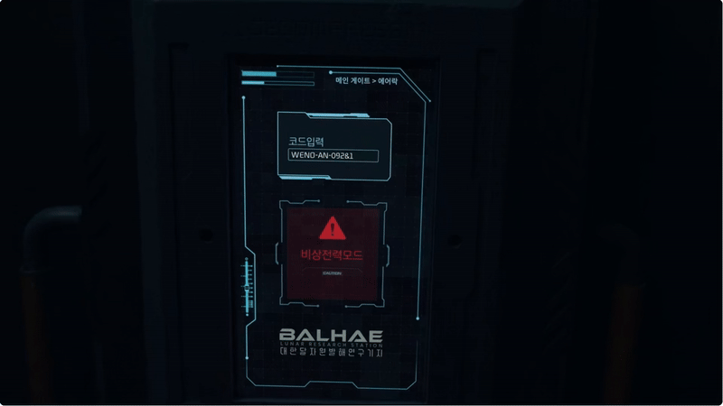
Control panel
Here’s a series of control panel screens, showing a mix of Korean and English. I found it interesting that many of the design elements are so small and thin, especially considering the astronauts’ thick gloves. You might expect a chunkier, more simplified design to accommodate the tactile limitations. However, as long as the interactive areas are large enough, the fine detail of the display becomes less of an issue and it makes for a visually elegant interface that doesn’t feel clunky.

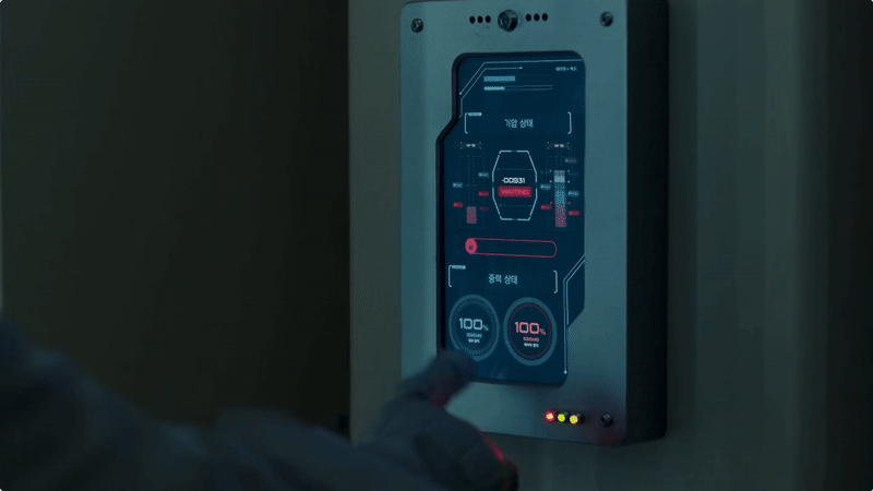

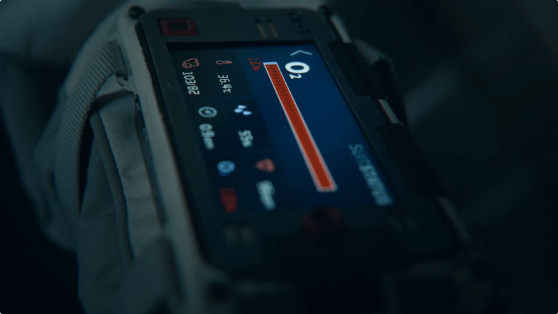
Wrist UI
The wrist UI is primarily used to display life stats, like oxygen levels and other vital signs, keeping the crew informed at a glance. It also doubles as an authentication device for accessing locked areas.